This is the first in a series of posts about Assessment and User Experience work on the libraries’ website and Tripod starting with a brief history of our current landscape (and with a nod to Kate Carter’s favorite canned search for “Bears: A Brief History.”)
The Libraries’ Website
Most academic library websites share a visual language. Above the fold it is common to see:
- Prominent catalog search at the top of the page (See this example from Kenyon College)
- A horizontal menu is across the top that drops down to expose top site content (See this example from Albion College)
- Links near the top of the page for Hours, Research Help (often Chat) and access to “My Account” (See this example from Oberlin College)
Below the fold, a variety of additional information of interest is common, for example:
- Quick Links to top resources, like this example at Bowdoin College
- Current information: library news, exhibitions, and highlights of particular services like this example from Skidmore
People who pay attention to urls may notice that each of these library web addresses begin with the word library (or a variation: libraries, lib, etc.) followed by institution name dot edu.
This url tidbit indicates that many academic library sites are separate from and adjacent to the larger sites of their parent institutions and they usually toggle back and forth via persistent links near the top of library webpages (often through word stamp logos.)
Most importantly, these sites serve (at least visually and often, functionally) as a single portal to resources in the library catalog and library services. Is it possible for someone at Smith College to skip the library site and perform a catalog search starting directly from the catalog itself? Maybe, but it would be difficult. (Give it a try and you’ll see what I mean.)
Swarthmore is different
Our library site lives under the swarthmore.edu navigation hierarchy just like all the other departmental sites at the college. Our url begins with swarthmore followed by dot edu slash libraries. There are solid reasons for this, but library site navigation and design are necessarily limited by the options available on the College site. As a result, our library site can not share the visual language or navigation options common to other robust academic library sites because these would interfere with swarthmore.edu site navigation.
What about Tripod?
Swarthmore user behavior is “Tripod-centric” meaning most of our library users go straight to Tripod for their library needs, bypassing the website entirely. In fact, many people here think Tripod is the “library website.” Last year the UX Team ran a quick poll asking students if they were aware the libraries have a website in addition to Tripod. 52.2 % of responders said “No.”
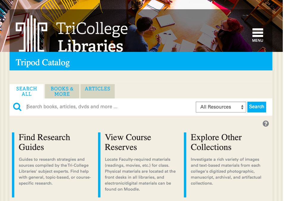
It’s possible that our history with the Tri-College libraries contributes to this culture. Previous to our Integrated Library System (ILS) migration to Alma/Primo, Tripod was built on the Millennium interface using open-source software called VuFind as the discovery layer. Bryn Mawr servers hosted the system and the url for all of us was “tripod.brynmawr.edu” Here’s a view from 2016:

We migrated to Alma/Primo at the end of 2018 for many reasons, but chief among them was to help eliminate confusion about access to electronic resources.
In the Tripod iteration pictured above, since we all used the same (brynmawr) url, library users at any school would see all electronic resources in the catalog whether their school licensed access or not.
As a result, people at Bryn Mawr (for example) did not understand why they could not simply click and get access to a resource purchased and licensed at Swarthmore only. Since the resource was online, it didn’t make sense to them that they should need to travel to Swarthmore to access it (and many librarians, including myself, enabled some legally questionable pathways around this problem.)
Our current configuration with Primo mostly eliminates this issue. Each Trico Library now has a unique url for Tripod and users see only the electronic resources purchased and licensed for their college. This configuration also allows each Library to (mostly) customize the public face of Tripod to match their College’s branding since our urls are now separate and school specific.
When we conducted web usability sessions of Alma/Primo at the time of migration, one comment I heard repeatedly from Swarthmore users was appreciation for the new, tripod.swarthmore.edu url. (Who knew urls meant so much to people? Reader, I did not.)
I have worked with colleagues and UX Interns over the years to make incremental changes to the library website and Tripod in hopes they would speak to one another more fluently and to better align with web behavior expectations common to academic library websites generally.
But the structural issues with our website and the cultural issues with Tripod remain.
Understanding this background will inform forthcoming posts exploring where we might go from here. Stay tuned!
