Tripod and the Libraries’ Website Part II

My earlier post, Tripod and the Libraries’ Website: a Brief History, summarized structural and cultural reasons that explain our current, siloed library web landscape: why our website is less robust than those of other academic libraries (and under-used as a result) and why a majority of our users think of our integrated library system, Tripod, as “the library website.”

I think it’s a problem. Here’s why:

Equating Tripod and the libraries’ website implicitly communicates a narrow view of what a library is and undermines our value.

It conveys the message that libraries are simply repositories for resources: books on shelves and connections to online resources which may be accessed from anywhere.

And this is a best case scenario. Often, students bypass Tripod as a starting place and begin their search for resources externally (through Google Scholar, for example) without realizing the libraries are usually licensing the content and providing full-text access to the resources they discover there.

This behavior contributes to the breezy misconception some students have that they don’t use, or even need the libraries.

Google Scholar is great. It is simple to search – probably easier than Tripod. Perhaps that’s why some students start their research there.

This is fine, and an improved library website will not necessarily change this behavior.

But research is a craft that is learned and that the libraries help to teach. As students develop research skills, Tripod searches begun through a robust library website would expose them to a more complete information ecosystem, including Digital Scholarship, Archives, Special Collections, and librarian expertise.

Contextualizing Tripod within this ecosystem would communicate an awareness of what libraries offer beyond catalog search results and more accurately situate them as a comprehensive component of a Swarthmore liberal arts education.

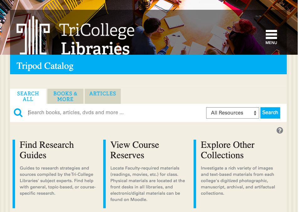
On its own, Tripod is not capable of communicating the depth of contextual information a good website could provide.

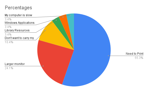
We know from user research that many students are unaware of library services and confused by terms and concepts that affect their research. Despite steady growth in the number of library instruction sessions and research consultations we provide each year, we’re far from reaching everyone. Yet unless students receive library instruction of some kind, they may miss important learning for both information and digital literacies.

A dynamic, more highly functional website could help by filling gaps, demystifying terms and concepts, and by providing intuitive pathways to library expertise.

So if I’d made my case, how do we get there?

Even if we agree to begin to shift our culture toward creating a website that serves as a single portal to resources in the catalog and the breadth of library affordances, some of us are aware of the structural barriers inherent in the current swarthmore.edu Drupal design.

Usability studies continue to indicate that what we have does not work well and we are building a case for change by demonstrating our need for greater functionality. Although change may be incremental for now, there may be interesting paths forward.

How many computers do we need?

This summer, the main floor of McCabe will be renovated in order to create a home for the Teaching and Learning Commons. In order to make room for and welcome our new neighbors, we need to reconfigure space near the large printers, reducing the number of computers in the area pictured, below, near the printers.

Computer workstations near the printers in McCabe

We’ve noticed less traffic in this area since the pandemic, but outside of anecdotal evidence, we need to learn how many desktop computers will meet our user’s needs. To find out, Access + User Services Supervisor, Patrick Sinko, and I looked at and analyzed the following data:

Quantitative Data

Our colleagues in ITS provided us with a spreadsheet that lists each computer in McCabe along with the following data points collected from August through December of 2023:

  • Number of logins
  • Total time the computer was in use, split between:
    • Active time
    • Idle time

We sorted the data by the number of logins and learned that the computers near the printer have the highest number – by far.

We next divided the amount of active time the computers were used by the number of logins to find an average of how much time people typically, actively spend at each of these computers and learned:

  • The computers closest to the printers are used for shorter periods of time, ranging from less than 10 minutes to up to 20 minutes
  • Computers further away from the printers are used for longer periods of time, with an overall average for these of 56 minutes
  • Users have a slight preference for Macs over PCs
  • PCs are used for longer periods of time than Macs

Qualitative data

Quantitative data is vital, but it doesn’t tell us why people choose to use computers in this area. To try to find out, we invited users to provide feedback via a form placed at each work station accessed by QR code. The form was anonymous, but to incentivize feedback, we agreed to send this “special edition sticker of McCabe” to any students who shared their names.

Special edition sticker of McCabe

We additionally included the row of docking stations in our qualitative study. (Docking stations are monitors + keyboards that people use connected to their personal device.) Even though the docking stations will remain available once the TLC renovation is complete, we wanted to get a sense of users’ preferences.

Docking stations (monitors + keyboards to be connected to personal devices) on the Main Floor

We received 32 responses to the form from February 2 through March 5, 2024. Here’s a summary of responses:

We first wanted to determine whether computer use was a priority, or whether perhaps the specific area of the library was a factor in choosing these spaces. We differentiated those possibilities in the first question on the form by asking “Why are you using this spot today?” and offered the following choices:

  • I’m using the computer or docking station
  • I like this spot and don’t need the computer or docking station
  • I’m here for both the equipment and the spot
  • Other

All but two users indicated that in addition to appreciating the spot, they were there to use the computer.

We next asked “If you’re using the computer, why?”

The qualitative data confirmed what we expected from the quantitative data: a majority of users were there to print. But what we had not anticipated was the level of desire for a larger (or additional) monitor.

Not wanting to carry (or having problems with) personal devices was the next highest reason, followed by one response for Access to Library Resources, and one for Access to Windows Applications.

Pie chart showing percentages for reasons why people choose to use the computers near the printers

Next, we hoped to learn how important it is to users that computers (or docking stations) remain in this area. The answer? Pretty important:

Graph showing the importance of keeping computers and docking stations near the printers

And finally, we wondered if our users have a preference for computers, or whether docking stations are fine. These results surprised me, since a docking station could just as easily satisfy the need for a larger, or second monitor and I had assumed a higher preference for these. I’ve just provided a great excellent example of why it’s important to get feedback from users rather than make assumptions. (You’re welcome!)

Pie chart showing preferences for computers or docking stations

Conclusion + Recommendations

It remains important for the libraries to provide computers near the printers, since as expected, they are used (a lot!) for printing.

  • If we keep our current furniture, reducing the number of tables from four to two will maintain space for 6 computers – a good number to accommodate printing needs. Since MACs are preferred, we could create a configuration of either 4 MACs and 2 PCs, or 3 of each type.
  • But if we swap out the current furniture for slightly less capacious workstations, we may be able to keep more computers in this area accommodating users who are drawn to work there for longer periods of time.

Although our form did not ask for specifics about why users like “this spot,” other studies (#SwatStudySpot, focus groups, and observational data) indicate preferences for:

  • natural light
  • a quiet hum of noise: quiet enough for focus, but without isolation and in the company of others
  • views to the outdoors or even expansive views inside buildings (high ceilings, large rooms, etc.)

While we may wish to find new homes in McCabe for the computers we’ll be moving away from the printers this summer, we should keep these characteristics in mind. Simply moving them to isolated places in McCabe may show decreased use.

Case in point: there are two computers on the 3rd floor that are used for longer periods of time (an average of 90 minutes or more) that are in an open lounge area near large windows and a balcony looking out over Parrish lawn. I would not have necessarily predicted this, but it makes perfect sense in light of what we know!

3rd floor lounge in McCabe with 2 Mac Computers

Tripod and the Libraries’ Website: A Brief History

This is the first in a series of posts about Assessment and User Experience work on the libraries’ website and Tripod starting with a brief history of our current landscape (and with a nod to Kate Carter’s favorite canned search for “Bears: A Brief History.”)

The Libraries’ Website

Most academic library websites share a visual language. Above the fold it is common to see:

  • Prominent catalog search at the top of the page (See this example from Kenyon College)
  • A horizontal menu is across the top that drops down to expose top site content (See this example from Albion College)
  • Links near the top of the page for Hours, Research Help (often Chat) and access to “My Account” (See this example from Oberlin College)

Below the fold, a variety of additional information of interest is common, for example:

  • Quick Links to top resources, like this example at Bowdoin College
  • Current information: library news, exhibitions, and highlights of particular services like this example from Skidmore

People who pay attention to urls may notice that each of these library web addresses begin with the word library (or a variation: libraries, lib, etc.) followed by institution name dot edu.

This url tidbit indicates that many academic library sites are separate from and adjacent to the larger sites of their parent institutions and they usually toggle back and forth via persistent links near the top of library webpages (often through word stamp logos.)

Most importantly, these sites serve (at least visually and often, functionally) as a single portal to resources in the library catalog and library services. Is it possible for someone at Smith College to skip the library site and perform a catalog search starting directly from the catalog itself? Maybe, but it would be difficult. (Give it a try and you’ll see what I mean.)

Swarthmore is different

Our library site lives under the swarthmore.edu navigation hierarchy just like all the other departmental sites at the college. Our url begins with swarthmore followed by dot edu slash libraries. There are solid reasons for this, but library site navigation and design are necessarily limited by the options available on the College site. As a result, our library site can not share the visual language or navigation options common to other robust academic library sites because these would interfere with swarthmore.edu site navigation.

What about Tripod?

Swarthmore user behavior is “Tripod-centric” meaning most of our library users go straight to Tripod for their library needs, bypassing the website entirely. In fact, many people here think Tripod is the “library website.” Last year the UX Team ran a quick poll asking students if they were aware the libraries have a website in addition to Tripod. 52.2 % of responders said “No.”

It’s possible that our history with the Tri-College libraries contributes to this culture. Previous to our Integrated Library System (ILS) migration to Alma/Primo, Tripod was built on the Millennium interface using open-source software called VuFind as the discovery layer. Bryn Mawr servers hosted the system and the url for all of us was “tripod.brynmawr.edu” Here’s a view from 2016:

Tripod homepage circa 2016
screen capture from the Wayback Machine of the Tripod homepage in 2016

We migrated to Alma/Primo at the end of 2018 for many reasons, but chief among them was to help eliminate confusion about access to electronic resources.

In the Tripod iteration pictured above, since we all used the same (brynmawr) url, library users at any school would see all electronic resources in the catalog whether their school licensed access or not.

As a result, people at Bryn Mawr (for example) did not understand why they could not simply click and get access to a resource purchased and licensed at Swarthmore only. Since the resource was online, it didn’t make sense to them that they should need to travel to Swarthmore to access it (and many librarians, including myself, enabled some legally questionable pathways around this problem.)

Our current configuration with Primo mostly eliminates this issue. Each Trico Library now has a unique url for Tripod and users see only the electronic resources purchased and licensed for their college. This configuration also allows each Library to (mostly) customize the public face of Tripod to match their College’s branding since our urls are now separate and school specific.

When we conducted web usability sessions of Alma/Primo at the time of migration, one comment I heard repeatedly from Swarthmore users was appreciation for the new, tripod.swarthmore.edu url. (Who knew urls meant so much to people? Reader, I did not.)

I have worked with colleagues and UX Interns over the years to make incremental changes to the library website and Tripod in hopes they would speak to one another more fluently and to better align with web behavior expectations common to academic library websites generally.

But the structural issues with our website and the cultural issues with Tripod remain.

Understanding this background will inform forthcoming posts exploring where we might go from here. Stay tuned!

#SwatStudySpot Project Wrap-up

This was an informative, fun, study with which to begin our year last fall. We invited students to fill out a brief form and upload a photograph of their favorite study spot in answer to our research question: What kinds of spaces help Swarthmore students focus on and accomplish their academic work?

The following preferences emerged:

  • Natural light (but even bright, interior lighting is better than darker spaces)
  • Expansive views – both interior views and views to the outdoors
  • Access to the outdoors and outdoor study spaces in good weather
  • Noise level preferences on a continuum from quiet spaces without any distractions to spaces with a low hum of activity, all the way to active, noisier spaces

Proximity to one’s dorm, options for food, and electrical outlets are preferred, as well as some things that are difficult to control – like the temperature of the room. (Thank you Underhill mezzanine for being “always warm when I’m cold.”)

UX Interns noted that study space preferences may shift over the course of a semester and depend on what kind of work they are trying to accomplish.

And an important thing I learned (which should not have surprised me) is the excellence of Swarthmore student photographers.

Sunlight illuminating interior study space in Singer Hall
Photo by Shuhao Ren, ’27
3rd floor lounge in McCabe looking out over the balcony to Parrish lawn and Clothier Tower
Photo by Emily Dong, ’27

Launching our first 2023/24 project: Share Your Study Spot Photo: Get a Sticker

The UX Interns are launching our first user feedback project for the year: a photo journal study aptly called: Share Your Study Spot Photo.

We’ve created flyers, (well, Amanda created them. Thanks Amanda Bonnet!) are posting them around campus and will follow up in a few days inviting students via email to fill out this form, upload a photo of their favorite spot and let us know why it’s their favorite in exchange for a laptop (or water bottle) sticker.

We’re hoping to learn some things about what kinds of environments students want and need in order to focus on their academic work, but truthfully, we’re also hoping to spread the word about our UX work and build our level of engagement with the campus community.

The photos will help inform our vision for library space renovations too! Stay tuned for what we learn.

The Student UX Team: What’s in Store for 23/24

After reflecting on how the Student UX Team has evolved for the past two years, I decided to do both less and more this coming year:

Less

There will be less administrative work. It comes at a cost of less flexibility for students, but I need this:

  • Rather than trying to accommodate all their schedules, I set a consistent time for a team meeting, with the understanding that I may be missing out on working with some excellent students who are not free to meet at the set time.
  • I capped the hours of independent work outside of the team meeting to two hours eliminating the need to follow up with students asking them to explain the hours they’ve submitted on timesheets and the worry that I’m not adequately tracking their work.

More

I’ve decided this is more than student employment. It is an Internship and expectations are higher:

  • Experiential learning + work experience + responsibility for an independent project = an Internship. My expectations for the students are higher and more specific.
  • They should expect more from me too. I’m far more organized this time around: I prioritized library projects and research needs and translated them into a syllabus that spans the academic year. It holds time for learning, training, practice, assessment, and reflection.
  • By the end, they will each have taken responsibility for planning and carrying out an independent user research project from soup to nuts, starting with articulating research questions, moving through identifying the best research method(s), carrying out research, analyzing results, and culminating in presenting their research to library leadership and other stakeholders.

What projects will we be working on?

  • Website Usability:
    • The Libraries’ Website, including the exploration of a possible new platform
    • Tripod enhancements and other discovery options
  • Qualitative research that contributes to the Libraries’ understanding of how Swarthmore students experience the libraries and in support of advocating for a major library renovation in the (near?) future:
    • A fun, photo journal study on most and least favorite study spaces on campus
    • Observational data on study space use
  • Quantitative research: Interns will contribute to crafting a student survey on the libraries to launch early in the spring semester.
  • Independent research projects: I’ve gathered a handful of departmental and college adjacent websites from which the Interns may choose as their independent research project.

I’m ready and eager to begin – let’s go!

Library Spaces Focus Groups: February 2023

The Student UX Team ran two additional focus groups on the topic of Swarthmore’s Library spaces. This feedback amplified what we heard last October and provided some additional insight into why students prefer Cornell to McCabe coalescing around the following themes:

Location

  • Most students have at least one STEM major, making the Cornell collections more relevant
  • Singer Hall [the new Biology, Engineering, and Psychology building] helps create a center of gravity with the Science Building and Cornell Science Library
  • Food is a huge factor. The new Dining Center is on the opposite end of campus from the science buildings, so many students choose to eat in the Science Center Cafe and so use Cornell instead.
  • McCabe was known for strict rules during the pandemic (no eating in the library) which sent people to Cornell since the Science Center Cafe is right there.
  • “If you’re not going to the new dining center, why would you go to McCabe?”

Vibe

  • There’s better visibility in Cornell. You can easily find a friend in Cornell. McCabe is like a lair – it’s hard to find people.
  • People want to socialize more after the pandemic restrictions and Cornell is better for that.
  • McCabe is old fashioned and has a reputation that isn’t inviting. Cornell is newer and cleaner.
  • “McCabe is a prison. You only go there when you have to.”

Let’s Talk About McCabe

I study there because:

  • It has a nice mix of brightly lit and dim spaces and it’s close to my dorm
  • It’s close to Narples [the new Dining Center] but no other reason

I don’t study there because:

  • The vibe is off, not as positive as other libraries 
  • Other libraries are closer; when they go to McCabe, it’s because it’s just the most convenient
  • McCabe is like one very long hallway

I would use McCabe more often if:

  • There were food nearby
  • My friends studied there
  • It were closer to academic buildings

McCabe needs:

  • More windows and natural light
  • More rooms like the LibLab that are open and inviting
  • To be more sociable. Placement of study tables are awkward making it hard to find a spot

What qualities are unique to Swarthmore that should be reflected in its libraries?

  • Nature aspect of Swarthmore: incorporate it with more windows and larger windows
  • Swarthmore has a lot of different people with different study styles, and the libraries should give them the opportunity to have access to both collaborative and private spaces
  • Swarthmore is close knit – spaces should take being comfortable in a small community into account
  • Books – they give the building life
  • Seeing people work motivates – work spaces with visibility
  • The Library should try to reflect the rich academic history of Swarthmore, McCabe can showcase some interesting historical artifacts from Friends Library, or Special Collections

LabX Focus Group 10.6.22

This group was made up of students who replied to an invitation to join a standing Library Advisory Board and User eXperience group, LabX. The yield from the invitation was small, so I invited more students from the Participant Pool, which yielded just one more. It could be there is less interest in LabX since the pandemic, or it could be simply a timing issue – it’s midterm week. The incentive to participate was a meal (provided by the Libraries) of Chipotle Burritos. Students arrived, exchanged introductions, began to converse over the meal and were then invited to participate in the following exercises facilitated by two UX Assistants:

Agree/Disagree Exercise

Two signs on the wall represented a continuum: Agree on the far left, and Disagree on the far right. Students were invited to place themselves on the continuum to represent their response to the following statements:

The Libraries are where I like to study: 5 Agreed

Comments were about the vibes at different libraries matching different needs for times of day and types of study. McCabe is quiet and where students go when they need to focus. Cornell fits for a daytime space or for times when it helps to know you are not alone. Underhill was noted for the space overlooking the Crumb Woods. One student commented that their dorm room is for relaxation and sleep only and talked about the importance of being in different spaces for different activities. The libraries are study spaces.

I need the Libraries for my academic work: 2 Agreed, 1 Neutral, 2 Disagreed

Although one student spoke of using books on reserve, most equated a need for the libraries with the need for study space.

Quote: ” The libraries are becoming more of a study space and less a repository for human knowledge.

There is a good balance of quiet and noisier space in the libraries – I can find a spot that suits my needs: 2 Agreed, 1 Neutral, 2 Disagreed

A lengthy discussion unfolded about noise levels with a unanimous desire for clearer indications for expectations on library signs. One student noted that the McCabe Directory indicates the Lower Level as a Quiet Floor and suggested we add the following – both to the Directory and to the signs as you enter each level:

  • Third Floor: Quiet Floor
  • Second Floor: Quiet Conversation
  • Main Level: open conversation is obviously ok – no sign needed

I appreciate learning about Library and Campus opportunities via [class list] emails: 2 Agreed, 2 Neutral (1 participant needed to leave early)

Representative Quotes:

  • ” I prefer to figure things out for myself and find the emails a nuisance. Emails from the library got lost in the flood”
  • ” I look through each of them. They help me learn of opportunities.”
  • “A monthly digest would be good. I wish there were a useful calendar rather than 500 emails.” (This comment received universal consensus)

I Like / I Wish / I Want Exercise

Students responded to these three prompts using post it notes and small dots for upvoting. Responses are below, with + signs added to indicate the number of upvotes. This exercise was intended to build suggestions and topics for future discussion and there was little inquiry or follow up to the ideas.

I Like

  • The authoritative quiet of McCabe Level 3
  • How we can appreciate nature in the middle of reading. ++
  • The variety of seating options in the libraries. +

I Wish

  • There were book recommendations from Swarthmore Faculty. +
  • There were maps of all the library interiors. ++
  • There were group quiet work sessions – like the Writing Center’s Write-Ins
  • Books were more accessible
  • There were LOC Call # education for all (or just more signs)

I Want

  • Better publicity for the loanable chargers and headphones
  • Better, more comfortable reading chairs in McCabe – like in Cornell’s upper floor corner
  • More pencils, paper, school supplies in the libraries. +
  • It to be warmer at night
  • More clarity for when snacks and drinks are available in McCabe
  • Shared information about how to read / write
  • Equipment for studying, like bookstands. +

Concluding Quote:

With less use of circulating library materials, we should focus on the study spaces and the expertise of those who work in the library. How can we make these libraries of the future?

Fall ‘ 22 Tripod Usability

The Student UX Team jumped straight into work this semester to write and workshop scenarios and facilitate web usability sessions designed to test out the usability of links added to the Tripod homepage designed to surface contextual content on the Libraries’ website. These are the tasks we chose:

  • Request a book that is not held by the TriCollege Libraries – Borrow Beyond Trico
  • Schedule an appointment with a Subject Specialist Librarian
  • Find help with citation styles
  • Reserve a study space
  • Access the most recent issue of a specific journal
  • Access today’s NY Times using Swarthmore credentials
  • Suggest a purchase

The team facilitated 10 sessions and learned:

Quick Links are visible and useful with 100% success rates for:

  • Borrowing Beyond Trico (all users chose the Quick Links on the bottom right of the page rather than the top link above the search bar.)
  • Scheduling an appointment
  • Finding help with citation styles
  • Reserving study space in the libraries
  • Suggesting a Purchase

Some Links were too slow

The Quick Links to the full records for both the NY Times and the Washington Post were so slow that many users assumed they were broken.

Multiple paths to information can be helpful

Students found their way to citation help via:

  • Research Guides link above the search bar
  • Get Help link above the search bar
  • A Quick Link for Research Help under the search bar

Fine Print in full results was ignored

Users did not explore granular information on full results pages for resources, for example the information on how to sign up for an Academic Pass for the New York Times via the Ejournals link, or the different coverage dates available via different vendors for the Annual Review of Anthropology.

What we changed:

  • Removed the individual Quick Links for the NY Times and the Washington Post
  • Moved the link to the Newspapers and Magazines LibGuide – in which users more readily saw information about the New York Times Academic Pass – out of the ‘Explore’ section and into the ‘Top Resources’ section
  • Reordered the sections on the Study Rooms and Spaces to move Group Study Spaces higher up the list
  • Asked our campus colleagues who manage the space reservation software to add the common name, ‘Color Room’ to the information about McCabe room 211, a popular space students may want to reserve but couldn’t identify in Swat Central by room number or formal name.

Additional Findings:

Confusion over multiple links to electronic access for one title

“Are these choices sequenced in any way? Is the top choice the recommended one?”

Even though explanations are present explaining the options from different vendors (most often about date coverage) users don’t notice or read them. People skim on the web, their eyes look for links and they miss the fine print.

  • Are we able to increase font size?
  • Would that matter?

Our drop-in sessions, lasting only about 10 minutes, may contribute to users not taking the time that they might if they were searching for something on their own. We’ll learn more when we run longer, in-depth Tripod sessions later this year.

Confusion remains over publishing terms

‘Journal,’ ‘Article,’ ‘Database,’ and sometimes even ‘Book,’ remain confusing terms for some students who needed clarification for the scenario in which they were to find the most recent issue of “The Annual Review of Anthropology.” And even though most completed the task successfully, more than a few did not seem clear on the concept of scholarly journal.

Research Guides are appreciated

“I got research instruction in class and found it really helpful – especially as a first and second year student. I learned about Research Guides and highly recommend using them.”

Explore effective communication

“I’m surprised you can do so many things here. The libraries should market things more for people who start with Google Scholar because they may not know about all the other resources. I learned a lot. A lot of people may not know about the resources the libraries have and it’s impressive.”

And a larger question:

Even though they accomplished the task successfully on our sites, most students said they would not look for citation help via Tripod, the Libraries’ site, Librarians, or RIAs (Research and Information peer associates.) Most said they would seek out a WA (peer Writing Associate) or use another well established site that they may have learned about in high school, like Purdue Owl.

This is fine! We’re happy they can find help with citations without us, but it’s interesting to hear. It could be an example of the shifting landscape and priorities for academic libraries and librarians. What library services do students truly need and how do their needs intersect with our expertise?

The Student UX Assistant Team!

Despite the ongoing pandemic last summer, Swarthmore College decided that students would return to campus to a fully residential, synchronous learning experience in the fall. I admit I was nervous at first, but in hindsight, I’m so grateful for the decision.

I prefer in-person interactions for user research, and while the pandemic related time of remote work, virtual interactions and asynchronous learning was challenging, it provided an opportunity to rethink how I’ve approached user research with our primary users – undergraduate students – particularly how I’ve employed their peers to help out. I decided to experiment with an entirely new approach to this student position.

In the past, I’d hire one or two students, train them to facilitate web usability sessions and do all of the rest of the work myself while struggling to keep them busy. They would begin with interest and energy and then melt away. I wasn’t surprised, but it was disappointing.

This year I tried a team approach; I hired more students, required more hours, trained them to do more and involved them in a much broader variety of user research methods than before.

While I had one experienced student return, the rest of the team was new, including two first year students. Bi-weekly, in-person training began in the fall with learning facilitation skills for website usability and card sorting sessions using the libraries’ website.

The site remains in need of work (always!) but we reorganized the main navigation and prioritized sub navigation sections: Libraries + Collections, and Research + Scholarship as a result of their findings.

Research + Scholarship remains a little ugly, but post-update usability sessions demonstrate it is more usable than before, since it covers content on one page that would be otherwise be hidden as a result of the constraints of the swarthmore.edu design. (No hover menus allowed for the Libraries’ pages!)

The team also explored focus group facilitation in the fall, aided by Kara Bledsoe, ’16, a former Swarthmore Library Intern and Research and Information Associate, now an analyst at Ithaka S+R. The Libraries had been working with Ithaka on a Library Visioning Project, and when Kara came to campus to run student focus groups for the process, she kindly met with the UX student team and involved them by giving them some responsibilities in those sessions.

The rise of the omicron variant meant a slower start to our spring semester projects, but once on campus, the team dove in. We met weekly rather than bi-weekly – the accelerated pace compounding their cumulative experience and contributing to being able to do more and to doing it better.

The team took responsibility for broader aspects of research projects, doing things I had previously done on my own and simply handed off to them. Now, rather than facilitating web usability sessions based on tasks and scenarios that I had provided, they identified site tasks and wrote scenarios of their own. After facilitating sessions, they conferred on and analyzed their results, comparing user behaviors they observed, and proposing changes to the sites.

They even presented their findings and suggestions for improvement to a group of library stakeholders for a particular usability project, completing the entire research cycle. Their presentation was well received (more so than it would have been had I been the presenter) and the students were gratified to have shepherded a project from beginning to end.

They also planned and facilitated a focus group in the spring and plan to build on that experience when they return, having already begun to generate a list of topics to explore and to discuss how to overcome logistical challenges: should we recruit a standing group that meets throughout the year, or would it be better to host a new group each time? How could we recruit students who don’t consider themselves to be library users? What different times and locations could we explore for hosting groups? What realistic (and not taxable) incentives might we provide to motivate participation?

Our work was energized in the spring by MLIS student intern, Khyra Lammers, on track to complete her degree from Drexel University this summer. Khyra helped me enormously by managing the team, attending our meetings (facilitating many of them) and regularly reminding me of an important bigger question: how can you make this model of a student team sustainable over time? She jump-started that process by beginning to organize our training materials and team schedule by moving things out of G-Drive and into the Moodle course management system used at Swarthmore.

At our final meeting of the semester, we reflected on what we accomplished and made plans not only for re-launching the team next fall, but for making it more visible, perhaps even broadening our reach by offering to support usability work in other departments. We congratulated the graduating seniors, including Khyra, and celebrated over vegan cupcakes.

My sincere thanks to Kara Bledsoe, ’16, and Khyra Lammers (Drexel MLIS, summer 2022) for their generosity and to Swarthmore students Khalium Enkhbayar, ’24, Rebecca Lin, ’22, Marisa Musenga, ’25, Sage Rhys, ’22, Nina Robinson, ’23, Helen Tumolo, ’22, and José Valdivia, ’23 for an outstanding year.