Fall ‘ 22 Tripod Usability

The Student UX Team jumped straight into work this semester to write and workshop scenarios and facilitate web usability sessions designed to test out the usability of links added to the Tripod homepage designed to surface contextual content on the Libraries’ website. These are the tasks we chose:

  • Request a book that is not held by the TriCollege Libraries – Borrow Beyond Trico
  • Schedule an appointment with a Subject Specialist Librarian
  • Find help with citation styles
  • Reserve a study space
  • Access the most recent issue of a specific journal
  • Access today’s NY Times using Swarthmore credentials
  • Suggest a purchase

The team facilitated 10 sessions and learned:

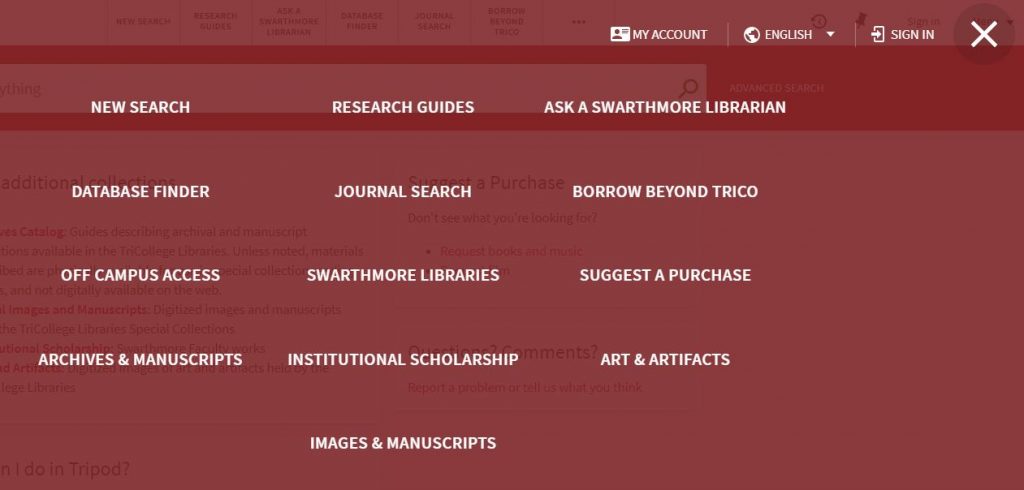
Quick Links are visible and useful with 100% success rates for:

  • Borrowing Beyond Trico (all users chose the Quick Links on the bottom right of the page rather than the top link above the search bar.)
  • Scheduling an appointment
  • Finding help with citation styles
  • Reserving study space in the libraries
  • Suggesting a Purchase

Some Links were too slow

The Quick Links to the full records for both the NY Times and the Washington Post were so slow that many users assumed they were broken.

Multiple paths to information can be helpful

Students found their way to citation help via:

  • Research Guides link above the search bar
  • Get Help link above the search bar
  • A Quick Link for Research Help under the search bar

Fine Print in full results was ignored

Users did not explore granular information on full results pages for resources, for example the information on how to sign up for an Academic Pass for the New York Times via the Ejournals link, or the different coverage dates available via different vendors for the Annual Review of Anthropology.

What we changed:

  • Removed the individual Quick Links for the NY Times and the Washington Post
  • Moved the link to the Newspapers and Magazines LibGuide – in which users more readily saw information about the New York Times Academic Pass – out of the ‘Explore’ section and into the ‘Top Resources’ section
  • Reordered the sections on the Study Rooms and Spaces to move Group Study Spaces higher up the list
  • Asked our campus colleagues who manage the space reservation software to add the common name, ‘Color Room’ to the information about McCabe room 211, a popular space students may want to reserve but couldn’t identify in Swat Central by room number or formal name.

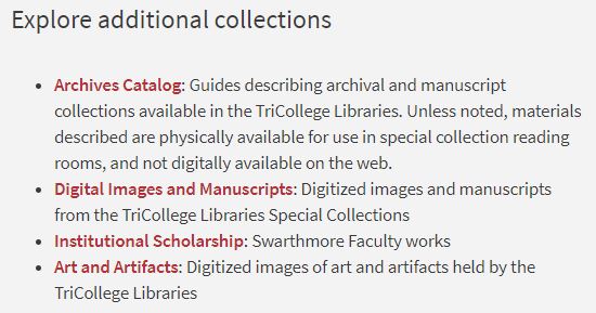
Additional Findings:

Confusion over multiple links to electronic access for one title

“Are these choices sequenced in any way? Is the top choice the recommended one?”

Even though explanations are present explaining the options from different vendors (most often about date coverage) users don’t notice or read them. People skim on the web, their eyes look for links and they miss the fine print.

  • Are we able to increase font size?
  • Would that matter?

Our drop-in sessions, lasting only about 10 minutes, may contribute to users not taking the time that they might if they were searching for something on their own. We’ll learn more when we run longer, in-depth Tripod sessions later this year.

Confusion remains over publishing terms

‘Journal,’ ‘Article,’ ‘Database,’ and sometimes even ‘Book,’ remain confusing terms for some students who needed clarification for the scenario in which they were to find the most recent issue of “The Annual Review of Anthropology.” And even though most completed the task successfully, more than a few did not seem clear on the concept of scholarly journal.

Research Guides are appreciated

“I got research instruction in class and found it really helpful – especially as a first and second year student. I learned about Research Guides and highly recommend using them.”

Explore effective communication

“I’m surprised you can do so many things here. The libraries should market things more for people who start with Google Scholar because they may not know about all the other resources. I learned a lot. A lot of people may not know about the resources the libraries have and it’s impressive.”

And a larger question:

Even though they accomplished the task successfully on our sites, most students said they would not look for citation help via Tripod, the Libraries’ site, Librarians, or RIAs (Research and Information peer associates.) Most said they would seek out a WA (peer Writing Associate) or use another well established site that they may have learned about in high school, like Purdue Owl.

This is fine! We’re happy they can find help with citations without us, but it’s interesting to hear. It could be an example of the shifting landscape and priorities for academic libraries and librarians. What library services do students truly need and how do their needs intersect with our expertise?

The Student UX Assistant Team!

Despite the ongoing pandemic last summer, Swarthmore College decided that students would return to campus to a fully residential, synchronous learning experience in the fall. I admit I was nervous at first, but in hindsight, I’m so grateful for the decision.

I prefer in-person interactions for user research, and while the pandemic related time of remote work, virtual interactions and asynchronous learning was challenging, it provided an opportunity to rethink how I’ve approached user research with our primary users – undergraduate students – particularly how I’ve employed their peers to help out. I decided to experiment with an entirely new approach to this student position.

In the past, I’d hire one or two students, train them to facilitate web usability sessions and do all of the rest of the work myself while struggling to keep them busy. They would begin with interest and energy and then melt away. I wasn’t surprised, but it was disappointing.

This year I tried a team approach; I hired more students, required more hours, trained them to do more and involved them in a much broader variety of user research methods than before.

While I had one experienced student return, the rest of the team was new, including two first year students. Bi-weekly, in-person training began in the fall with learning facilitation skills for website usability and card sorting sessions using the libraries’ website.

The site remains in need of work (always!) but we reorganized the main navigation and prioritized sub navigation sections: Libraries + Collections, and Research + Scholarship as a result of their findings.

Research + Scholarship remains a little ugly, but post-update usability sessions demonstrate it is more usable than before, since it covers content on one page that would be otherwise be hidden as a result of the constraints of the swarthmore.edu design. (No hover menus allowed for the Libraries’ pages!)

The team also explored focus group facilitation in the fall, aided by Kara Bledsoe, ’16, a former Swarthmore Library Intern and Research and Information Associate, now an analyst at Ithaka S+R. The Libraries had been working with Ithaka on a Library Visioning Project, and when Kara came to campus to run student focus groups for the process, she kindly met with the UX student team and involved them by giving them some responsibilities in those sessions.

The rise of the omicron variant meant a slower start to our spring semester projects, but once on campus, the team dove in. We met weekly rather than bi-weekly – the accelerated pace compounding their cumulative experience and contributing to being able to do more and to doing it better.

The team took responsibility for broader aspects of research projects, doing things I had previously done on my own and simply handed off to them. Now, rather than facilitating web usability sessions based on tasks and scenarios that I had provided, they identified site tasks and wrote scenarios of their own. After facilitating sessions, they conferred on and analyzed their results, comparing user behaviors they observed, and proposing changes to the sites.

They even presented their findings and suggestions for improvement to a group of library stakeholders for a particular usability project, completing the entire research cycle. Their presentation was well received (more so than it would have been had I been the presenter) and the students were gratified to have shepherded a project from beginning to end.

They also planned and facilitated a focus group in the spring and plan to build on that experience when they return, having already begun to generate a list of topics to explore and to discuss how to overcome logistical challenges: should we recruit a standing group that meets throughout the year, or would it be better to host a new group each time? How could we recruit students who don’t consider themselves to be library users? What different times and locations could we explore for hosting groups? What realistic (and not taxable) incentives might we provide to motivate participation?

Our work was energized in the spring by MLIS student intern, Khyra Lammers, on track to complete her degree from Drexel University this summer. Khyra helped me enormously by managing the team, attending our meetings (facilitating many of them) and regularly reminding me of an important bigger question: how can you make this model of a student team sustainable over time? She jump-started that process by beginning to organize our training materials and team schedule by moving things out of G-Drive and into the Moodle course management system used at Swarthmore.

At our final meeting of the semester, we reflected on what we accomplished and made plans not only for re-launching the team next fall, but for making it more visible, perhaps even broadening our reach by offering to support usability work in other departments. We congratulated the graduating seniors, including Khyra, and celebrated over vegan cupcakes.

My sincere thanks to Kara Bledsoe, ’16, and Khyra Lammers (Drexel MLIS, summer 2022) for their generosity and to Swarthmore students Khalium Enkhbayar, ’24, Rebecca Lin, ’22, Marisa Musenga, ’25, Sage Rhys, ’22, Nina Robinson, ’23, Helen Tumolo, ’22, and José Valdivia, ’23 for an outstanding year.

Wrap up the semester and tie it in a bow

I recently hosted a usability drop-in session supported by one of my student usability workers. We ran two navigational tasks on our catalog site: 1) finding reserves and 2) finding links to archival and digitized collections.

We used A/B testing for the second task; I ran the sessions using a test instance of our site on which I had placed links to other collections on the catalog home page, while the student assistant ran the tasks using the live site, where the links are behind a “more” button and a curtain.

Reserves

We ran a reserves task last spring within a few months of launching Alma/Primo and learned that users were not able to complete the task successfully. At all. While I do not like to admit that we’ve done nothing in the meanwhile to make it easier for users, this time the results were quite different:

  • 66% of users in our session successfully found reserves by searching by either the course name or course code and limiting their search with the Course Reserves scope.
  • 22% searched by course title and used facets to find reserves.
  • 11% of users looked for a top link to Reserves and they were not successful.

Huzzah! The only explanation I have for greater success is that once we knew addressing the problem with a customized solution would take months, we communicated the out-of-the-box path to Course Reserves through a variety of channels. Perhaps the communication had an effect, or perhaps users have become more familiar with the system and have learned the pathway as it is without customization.

Despite greater levels of success, since the users who struggled with the task continue to look for a top link for Reserves, the TriCollege Discovery and User Experience group (DUX) will discuss customization options.

Coincidentally, I’ve been conducting an environmental scan of other Alma/Primo sites within the Oberlin Group of colleges and found that Albion, Hope and Kalamazoo Colleges have put a solution in place that we’ll evaluate. We may also explore the solution that Whitman College Library created by customizing two separate scope options within the main search bar.

Links to Other Collections

I chose this task because I’m motivated to reduce the number of top links in Tripod. Our users naturally look to the top links, but when they click on the more button (identified by three horizontal dots)

the more button

they are faced with an off-putting curtain of thirteen links.

curtain of 13 links

The reason 13 appear is that the system repeats the first 6 links which already appear at the top of the home page and adds the rest. Since I haven’t found anyone who has managed to eliminate the redundancy, I’d like to reduce the overall number of links to no more than six in order to make the more button unnecessary.

The results of this usability session pointed to a solution (already implemented) that replaces the final four links behind the curtain with highlighted space on the catalog homepage.

Each user whose session took place on the test instance with this card in place found the collections easily, while users exploring the live site had trouble.

elevated to the home page

I’m pleased with the progress we are making with usability at Swarthmore. I’m grateful for a great team of student assistants who support the mechanics of usability sessions and for receptive colleagues.

Yet my experience tells me that usability results often point to larger conceptual questions in addition to the web fixes that might be addressed by our developers and this can be disheartening.

It’s great if developers implement changes that solve usability issues, but library research and catalog user experience can go beyond things that might be addressed with code.

  • How can we build contextual information about how to do research, where to find appropriate resources and how libraries and databases function into the catalog?
  • How can our web pages, the catalog and LibGuides play together more intuitively to the benefit of our users?

Library Website Usability Sessions

Student library UX workers and I facilitated 14 usability sessions on the Libraries’ website in late September in order to learn whether changes made to the site over the summer are intuitive for users.

We began each session by asking basic demographic information, the user’s year in school or college affiliation and general areas of academic interest. We also asked if they had ever used the site before and followed up by asking “why-or-why-not?” (And it was at this point we learned that many Swarthmore students think that the Tripod catalog and the Libraries’ website are the same thing…)

We ended each session by asking about impressions of the site, what works, what does not and what could make it better.

In between these opening and closing questions, facilitators used scenarios which prompted users to accomplish at least one (but not all) of the following tasks using the site:

  • Find different kinds of research help
    • Find citation help
  • Get access to popular resources: the New York Times and The Economist
  • Find space for quiet study and group study spaces
    • Reserve a group study
  • Borrow Technology
  • Discover what online resources are available to Alumni
  • Find information for visitors: hours, use of computers, printers, scanners, and group study rooms.

Here is what we learned:

Research Help + Citation Help
We captured 9 sessions using the Research and Citation Help scenarios. While eight of the nine users ultimately had success finding at least one kind of research help using the site, only one user, a librarian, began at the Get Help page.

Alternate successful paths to research help were via:

  • a link to Research Guides within the Tripod search widget
  • the Chat button
  • Support for Research + Teaching>for Students

Duplicate paths to information can be great, but since students did not use (or maybe see or understand) the Get Help link, we’re considering adjustments. We may change the label (after testing out suggestions for something more intuitive) and we may consider integrating the Get Help content with overlapping content on the Support For Students page.

An unexpected outcome of this task was to learn that many students equate finding resources with getting research help. If a user begins with this understanding, choosing the “Find Resources” link instead of “Get Help” makes perfect sense, but the result is that students overlook or remain unaware of the variety of library support available outside of the Tripod catalog.

More than half of the users began this task with either a Tripod catalog search or via the Find Resources link in the site navigation instead of Get Help. A majority of them probably would not have discovered information about the kinds of research help from Librarians or Guides for which the scenarios were designed except for being encouraged to seek it due to the context of the usability session.

There was only a 50% success rate for the citation help task. If the user began seeking research help by looking for resources, they were not successful in finding citation help on the site.

Additionally, these unsuccessful sessions demonstrated that anyone who searched the entire College website (via the site search magnifying glass) using the term “citation” or “citations” was not successful. Instead, top results for these queries on the College site are for the Writing Center, academic departments, and even the Public Safety Department. (Parking tickets!)

We’re adjusting our headings in hopes of having citation help from the libraries appear as a top result in a search of the College website, but the problem raises an additional structural issue that affects library site usability: a lot of library help is in LibGuides, and as a result is not exposed to a site search within swarthmore.edu.

The citation information on the Writing Center website is quite good although not as thorough as what the Libraries’ offer (via LibGuides.) Is there any opportunity here to collaborate with the Writing Center by linking to one another’s information?

We’re also exploring the feasibility of a technical solution that may pull LibGuides content into a swarthmore.edu site search.

Find Popular Resources
We captured 7 sessions of this task beginning with getting access to the New York Times. Three users had success via the Popular Online Resources page. Another three tried a Tripod search for the Times, but only one of these had success getting access. One user could not get access to the Times at all.

The Popular Resources page is a help to those who find it, but it’s buried in the navigation. A hover menu would be a big help.

Library Space
We ran this task in four sessions and each user had success.

Borrow Technology
We ran eight instances of this task with mixed results. The information is on the Support for Students page, but underneath the rather confusing heading “Need Something?”

Since many users were looking for the information on the Borrow + Request page, I added it there and it had an immediate effect.

Overall, six users were able to find the information, (some after I had changed the site) but three were unable to find it even after the change.

A common response to this scenario was “I already know the libraries lend chargers and I would just go to the desk and ask for one.”

Alumni + Visitor tasks
Users were mostly successful with these tasks, but whenever they were not, it was due to the information being organized into Drupal link-list-panes. If the user chose the wrong link, they did not return to the list in order to accomplish the task.

As a result, we have plans to reorganize the information out of the current combined page into separate pages, one for Alumni and another for Visitors.

Larger Issues
Many of our users are confused by the interplay of the Libraries’ website and the Tripod catalog. Additionally, usability of our website suffers from being unable to provide hover menus that expose the extent of our content at a glance.

While we may be able to address Tripod issues and branding with our Trico partners, the path to resolving functional and structural limitations at the College is not as clear. Meanwhile, we’ll continue to make changes to the navigation within the structure we have and continue testing for usability.

Small victories

A few weeks ago I overheard someone say “The month of August is like one, long Sunday evening” and I smiled, knowing exactly what she meant. It’s a bittersweet time saying goodbye to a more relaxed summer pace in the libraries mixed in with our preparation for saying hello to the official start of the semester, which is still a week away. But if the analogy holds true, I believe the weekend is over and it’s already Monday morning despite the calendar indicating it’s still August!

Student athletes who compete in autumn sports arrived last week and international students arrived several days ago along with cohorts of students whose jobs facilitate the beginning of the semester or require intensive training (resident advisers, student academic mentors, orientation leaders and the like.)

As I arrived at work this morning, it was abundantly clear that today is “move in day” for first year students. Ready or not, we’re off to the races!

My work is not greatly affected by the seasonal shifts of the academic year. It’s true there are fewer library users in the summer months, but I remain as engaged as ever as an advocate for their ideas and improved experiences.

But even though I’ve been at this for awhile, it continues to surprise me how much time can elapse from first learning the germ of a good idea for an improved service to turning the idea into reality.

Almost one year ago, students in the Library Advisory Board and User Experience Group (LabX) suggested we post guides to LC class subject areas within the stacks at the point of need, for example placing a small poster at the beginning of the “As” saying: A class is for General Works, Encyclopedias, Dictionaries, etc.

This was a simple idea I thought would be easy to turn into reality. But the pathway took more twists than I imagined and it started with library staff discussions about instead providing a guide to the entire range of LC subjects centrally on each floor and making attractive LC Class subject guide bookmarks freely available. That is, er, not providing the stack guides at the point of need or curiosity.

This example of advocating for users is certainly a low stakes one; moving forward with the idea was not expensive or disruptive and the impact may not be measurable beyond any appreciation expressed by the student group which offered the suggestion.

But it illustrates that user advocacy can be tricky, particularly in an institutional environment that has a heart for consensus and a decision making structure that is sometimes opaque.

I have been grateful for this low-stakes project because it has provided me with needed practice to grow more confident professionally despite push back from trusted and well meaning colleagues.

I hung the stack guides up at the end of yesterday and felt victorious.

Best wishes for the new academic year everyone!

Dog Days of Summer

It’s a Friday afternoon in the midst of a punishing heatwave in Swarthmore during the dog days of summer…

Photo by Paulette Wooten on Unsplash

…we’re just past the midpoint of the calendar year and a new academic year is on the horizon. What a good time to take stock of some of the goals we have achieved so far and to think about new ones for the upcoming year.

Since starting in this position, I’m proudest of these things:

  • IRB approval for usability testing
  • Approval to hire students at the highest pay grade who earn CITI certification and are trained as usability session facilitators
  • Robust usability sessions of our online library tools each month. Huzzah!
  • Establishment of an engaged Library Student Advisory Board for User eXperience (LabX) which meets monthly and provides invaluable feedback
  • Improved wayfinding signs in McCabe Library with the help of my colleague, Visual Initiatives + Exhibitions Librarian Susan Dreher

Some goals for this coming year:

  • Communicate my work more effectively through more frequent, shorter blog posts, posts to our library staff email digest, flyers, and an occasional newsletter (maybe…)
  • Collaborate with the AUX Committee to formalize our Assessment Plan based on our operational goals and objectives
  • Cultivate the use of our Data Dashboard for more cross-pollination of our data stories
  • Seek out relationships in the college community outside the libraries. I’m looking at you Office of Institutional Research, Communications Office and Center for Innovation and Leadership!
  • Continue to work on the ACRL Proficiencies for Assessment Librarians and Coordinators
  • Build relationships with librarians outside of Swarthmore College by becoming more active in professional organizations

Happy weekend – stay cool and hydrated!

Bench-marking the user experience from one interface to another

As we settle in becoming more accustomed to the newest version of Tripod, it is useful to look back and remember the massive amounts of work that went into system migration.

A year ago, most of my colleagues were heavily invested in necessary behind-the-scenes planning and technical work, while I focused on how best to address the approaching changes to the public-facing user interface with our users.

Many of us have opinions about how we’d like websites to look and feel in addition to how we want them to work, but the best way to know whether an interface functions well aside from visual design is through usability testing. Are users able to accomplish the tasks for which they came to the site?

In preparation for system migration, I held usability sessions with the now-retired version of Tripod in order to be able to compare results for how users accomplished essential tasks there with what we would learn from usability sessions in the new system.

What tasks are essential to users of a library search interface? We decided to test the following:

  • Account login: including saving items of interest to lists, sharing them with others or sending them to yourself via email or text
  • Known-item searches: placing a hold or a request from another Trico Library, and if the item is not available, taking the next step toward E-ZBorrow and ILL
  • Broad searches followed by use of facets (the “Refine your Search” options at the left of the screen) to limit results
  • Finding items on Reserve for class

In the fall of 2018, users of “old” Tripod had success logging into their accounts, adding items to lists of favorites, and emailing or texting the information to themselves or a research partner.

They were able to find specific titles and to place holds and Trico requests. And despite some participants having no experience with E-ZBorrow or ILL, they had heard about these services and were able to navigate to the appropriate links.

But despite the near ubiquity of facets on monster, commonly used websites like Amazon, many Swarthmore students either have not noticed them in Tripod or have not used them. This task caused trouble.

And every user struggled to find items on Reserve for a specific course using Tripod.

These results were not surprising. Library searching can be complex, we know there are students who do not use Tripod and novice researchers may struggle with even the most intuitive interface. The purpose of these sessions was to set a baseline for comparing results between old and new Tripod.

So about those! Results from post-launch usability sessions on “new” Tripod early in 2019 were largely the same: students navigated intuitively to the basics of what they could accomplish while logged into their account, they found relevant results for their known-item searches and pathways to place requests and to borrow beyond Trico. They also overlooked facets and really struggled to find Reserves!

We’ve already made improvements to the Tripod interface and have prioritized making the pathway to Reserves more intuitive before classes begin in the Fall.

Regular usability sessions are vital to improving user interfaces and the libraries run them monthly during the school year. Keep your eyes out for calendar announcements, stop by and try it! The “tests” are of our online interfaces, not users! It’s fun, you’ll be rewarded with a home-baked treat, and best of all, you’ll help to keep making Tripod (or the website, or Research Guides) better!

Serendipity…

…the occurrence and development of events by chance in a happy or beneficial way.

Several years ago, I was invited to work with a Swarthmore College alumnus to learn about website user experience and to use what I learned for our library catalog redesign project. The alumnus had offered his time to the College and I happened to be available and interested in a new project. While the redesign project was compelling, the biggest impact for me was the revelation of a new focus in librarianship.

My exposure to the power of observing how users navigate our tools created a deep interest, not only in how users interact with the shared, online tools we provide, like Tripod (our library catalog) and Research Guides, but also in the broader contest of the role of the libraries in the research process.

How do our users approach their research? How do they navigate finding what they seek? How can we best support this process? How do information architecture, web content, writing for the web and web design work together to propel research forward, or alternatively, raise barriers or introduce pain points that get in the way? How do we provide the best environment for discovery? What role do library spaces and services play in the research process?

One of my goals as the Assessment and User Experience Librarian @ Swarthmore is to communicate regularly about what I’ve learned from user experience and assessment projects. I’d like to share our practices for user research, be able to demonstrate why it’s important and what impact it has on our systems and spaces.

To close my first post, I’ll share the graphic, below, created by library UX practitioner Andy Priestner and first unveiled at his talk at the 2017 UX in Libraries conference in Glasgow. For additional fun, you may follow the prompts at this site created by another library UX practitioner, Vernon Fowler, and score where you think your library falls on these continua. For even more fun, try it as a group and talk about where you would place your library.