As we settle in becoming more accustomed to the newest version of Tripod, it is useful to look back and remember the massive amounts of work that went into system migration.
A year ago, most of my colleagues were heavily invested in necessary behind-the-scenes planning and technical work, while I focused on how best to address the approaching changes to the public-facing user interface with our users.
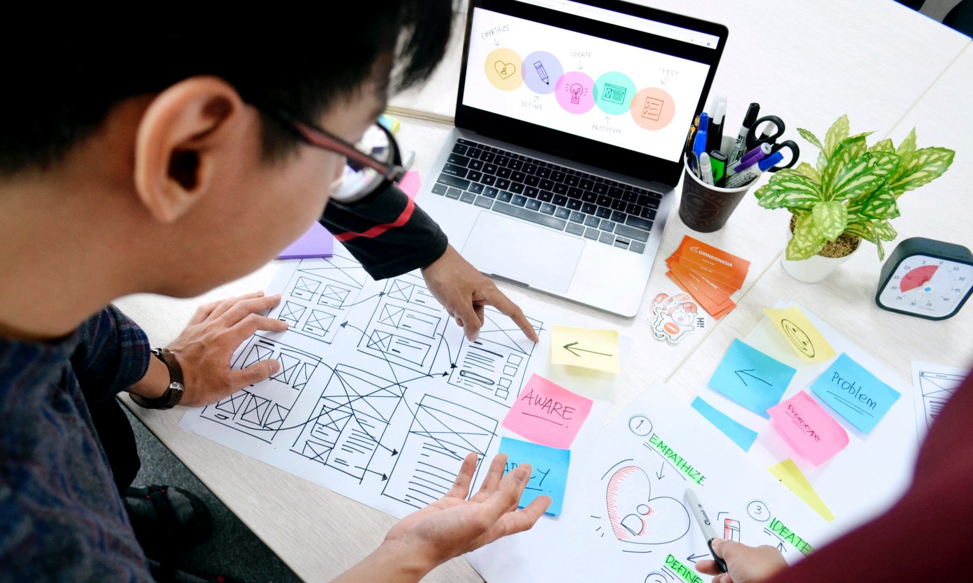
Many of us have opinions about how we’d like websites to look and feel in addition to how we want them to work, but the best way to know whether an interface functions well aside from visual design is through usability testing. Are users able to accomplish the tasks for which they came to the site?
In preparation for system migration, I held usability sessions with the now-retired version of Tripod in order to be able to compare results for how users accomplished essential tasks there with what we would learn from usability sessions in the new system.
What tasks are essential to users of a library search interface? We decided to test the following:
- Account login: including saving items of interest to lists, sharing them with others or sending them to yourself via email or text
- Known-item searches: placing a hold or a request from another Trico Library, and if the item is not available, taking the next step toward E-ZBorrow and ILL
- Broad searches followed by use of facets (the “Refine your Search” options at the left of the screen) to limit results
- Finding items on Reserve for class
In the fall of 2018, users of “old” Tripod had success logging into their accounts, adding items to lists of favorites, and emailing or texting the information to themselves or a research partner.
They were able to find specific titles and to place holds and Trico requests. And despite some participants having no experience with E-ZBorrow or ILL, they had heard about these services and were able to navigate to the appropriate links.
But despite the near ubiquity of facets on monster, commonly used websites like Amazon, many Swarthmore students either have not noticed them in Tripod or have not used them. This task caused trouble.
And every user struggled to find items on Reserve for a specific course using Tripod.
These results were not surprising. Library searching can be complex, we know there are students who do not use Tripod and novice researchers may struggle with even the most intuitive interface. The purpose of these sessions was to set a baseline for comparing results between old and new Tripod.
So about those! Results from post-launch usability sessions on “new” Tripod early in 2019 were largely the same: students navigated intuitively to the basics of what they could accomplish while logged into their account, they found relevant results for their known-item searches and pathways to place requests and to borrow beyond Trico. They also overlooked facets and really struggled to find Reserves!
We’ve already made improvements to the Tripod interface and have prioritized making the pathway to Reserves more intuitive before classes begin in the Fall.
Regular usability sessions are vital to improving user interfaces and the libraries run them monthly during the school year. Keep your eyes out for calendar announcements, stop by and try it! The “tests” are of our online interfaces, not users! It’s fun, you’ll be rewarded with a home-baked treat, and best of all, you’ll help to keep making Tripod (or the website, or Research Guides) better!