I recently hosted a usability drop-in session supported by one of my student usability workers. We ran two navigational tasks on our catalog site: 1) finding reserves and 2) finding links to archival and digitized collections.
We used A/B testing for the second task; I ran the sessions using a test instance of our site on which I had placed links to other collections on the catalog home page, while the student assistant ran the tasks using the live site, where the links are behind a “more” button and a curtain.
Reserves
We ran a reserves task last spring within a few months of launching Alma/Primo and learned that users were not able to complete the task successfully. At all. While I do not like to admit that we’ve done nothing in the meanwhile to make it easier for users, this time the results were quite different:
- 66% of users in our session successfully found reserves by searching by either the course name or course code and limiting their search with the Course Reserves scope.
- 22% searched by course title and used facets to find reserves.
- 11% of users looked for a top link to Reserves and they were not successful.
Huzzah! The only explanation I have for greater success is that once we knew addressing the problem with a customized solution would take months, we communicated the out-of-the-box path to Course Reserves through a variety of channels. Perhaps the communication had an effect, or perhaps users have become more familiar with the system and have learned the pathway as it is without customization.
Despite greater levels of success, since the users who struggled with the task continue to look for a top link for Reserves, the TriCollege Discovery and User Experience group (DUX) will discuss customization options.
Coincidentally, I’ve been conducting an environmental scan of other Alma/Primo sites within the Oberlin Group of colleges and found that Albion, Hope and Kalamazoo Colleges have put a solution in place that we’ll evaluate. We may also explore the solution that Whitman College Library created by customizing two separate scope options within the main search bar.
Links to Other Collections
I chose this task because I’m motivated to reduce the number of top links in Tripod. Our users naturally look to the top links, but when they click on the more button (identified by three horizontal dots)
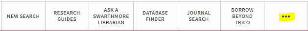
they are faced with an off-putting curtain of thirteen links.
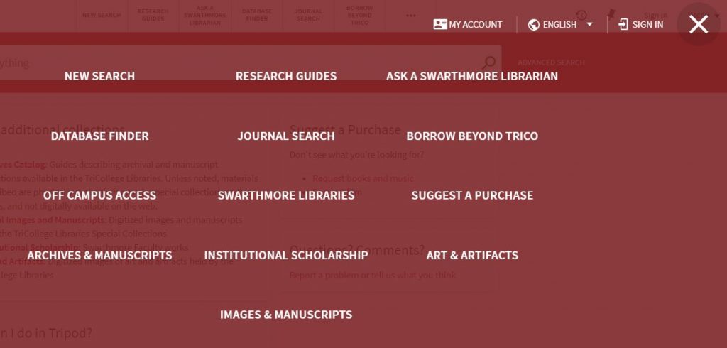
The reason 13 appear is that the system repeats the first 6 links which already appear at the top of the home page and adds the rest. Since I haven’t found anyone who has managed to eliminate the redundancy, I’d like to reduce the overall number of links to no more than six in order to make the more button unnecessary.
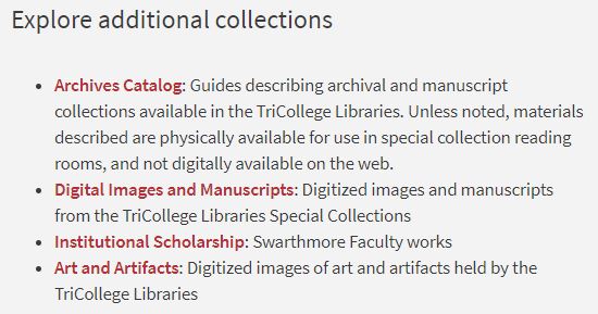
The results of this usability session pointed to a solution (already implemented) that replaces the final four links behind the curtain with highlighted space on the catalog homepage.
Each user whose session took place on the test instance with this card in place found the collections easily, while users exploring the live site had trouble.
I’m pleased with the progress we are making with usability at Swarthmore. I’m grateful for a great team of student assistants who support the mechanics of usability sessions and for receptive colleagues.
Yet my experience tells me that usability results often point to larger conceptual questions in addition to the web fixes that might be addressed by our developers and this can be disheartening.
It’s great if developers implement changes that solve usability issues, but library research and catalog user experience can go beyond things that might be addressed with code.
- How can we build contextual information about how to do research, where to find appropriate resources and how libraries and databases function into the catalog?
- How can our web pages, the catalog and LibGuides play together more intuitively to the benefit of our users?