This post is by Anna Hansson, ’26, a double major in Computer Science and Mathematics with an emphasis in Statistics. Anna is interested in combining her passions for art and technology to explore UX Design.
This semester, I worked as a Library UX Intern on a new website design for the Special Collections page. The current page lacks adequate descriptions of the research catalogs: the Tri-College Libraries Digital Collections, Archives & Manuscripts, and Tripod. These databases are nuanced and can be difficult for novice users to navigate. Additionally, some users may have trouble distinguishing between the four special collections at Swarthmore: Friends Historical Library, College Archives, Peace Collection, and the Rare Book Room.
These problems sparked my research project, where I sought to answer: What content should go on the shared Special Collections library page, and how should it be organized for usability? My goal was to create a webpage that offers clear and intuitive access to each individual collection.
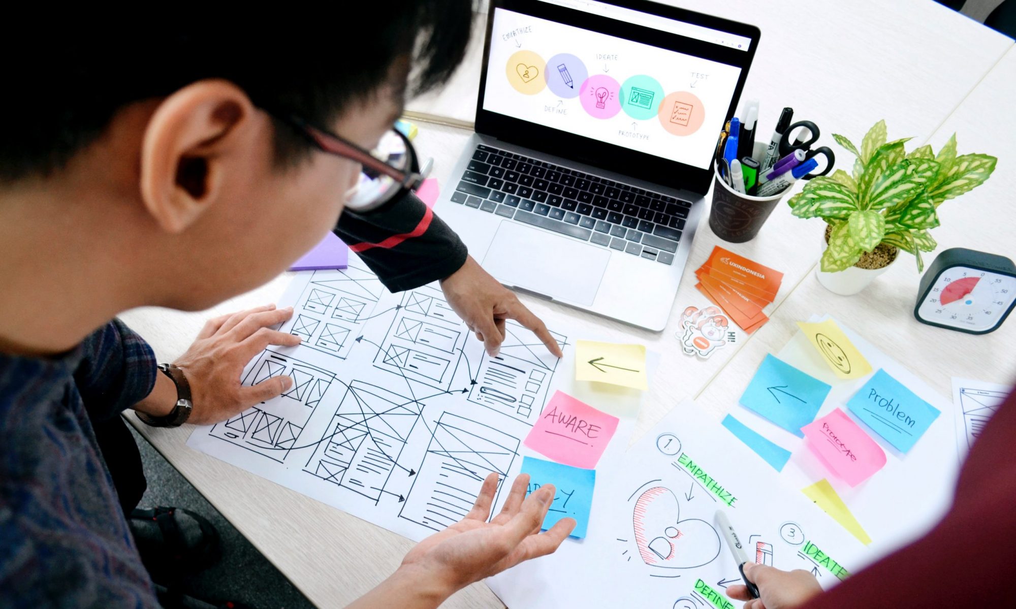
To start, I conducted research to understand the differences between the collections and the catalogs. I then designed a wireframe and developed it into a functional prototype using Drupal, Swarthmore’s content management system.

My main priority was to make the site easy to use, especially for new users. On the homepage, I created four boxes for each collection with a description and links for more information. I specifically worked on the “Search the Collections” page, which explains the different catalogs when to use them.

To evaluate the site’s design, I conducted usability sessions with two students. This research method is used to see how users interact with the site and identify design issues. I created scenarios where the site would be used to accomplish the task. Some scenarios I used were:
- “You are working on a project about the Underground Railroad and want to find online resources for your assignment. Which Special Collection would you use?”
- “What catalog would you search in preparation for using Special Collections materials needed for a research project?”
Throughout the sessions, I asked the users what felt difficult and what was intuitive. Both participants commented that it was difficult to distinguish between the collections, specifically when to use the Friends Historical Library. Even with just two sessions, we start to see usability patterns, and further testing will help refine the site’s design.

The next steps of this project are to test more users to address usability challenges and to redesign the “Student Opportunities” page to improve layout and understanding.
Overall, this project was a valuable learning experience in web design and usability. I’m excited to apply the skills and insights I’ve gained to future work.