Blog post author, Nathanael Brown, ’25, is from Blanchard Township, Maine. He’s an Honors History major and Honors German Studies minor. In addition to his many college commitments, he has enjoyed fencing with Swarthmore’s club team, participating on the mock trial team, and working in the Theater Department.
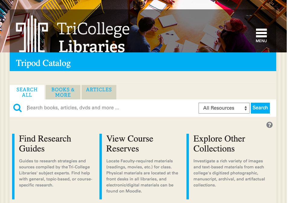
This past semester, I worked on a study to evaluate the current version of Tripod that the libraries were using, and prepare some suggestions on how to migrate information from the Libraries’ website over to Tripod to make the homepage more robust and useful to students.
Research Questions:
- How might we better integrate contextual information about libraries and library services into Tripod (since that site is more frequently visited)?
- What information is most essential to users, and how do we make the information as accessible to them as possible?
- How do we make things intuitive while also adding the right amount of information?
To answer these questions, I drew on existing studies conducted by the UX team in the fall, such as our Libraries’ Website Usability sessions and Tripod Interviews, to gain a better understanding of how students use both sites. With this information, I drafted a list of recommended webpages for the new Tripod. I then conducted a closed card sort with the links and four categories that I had created myself.
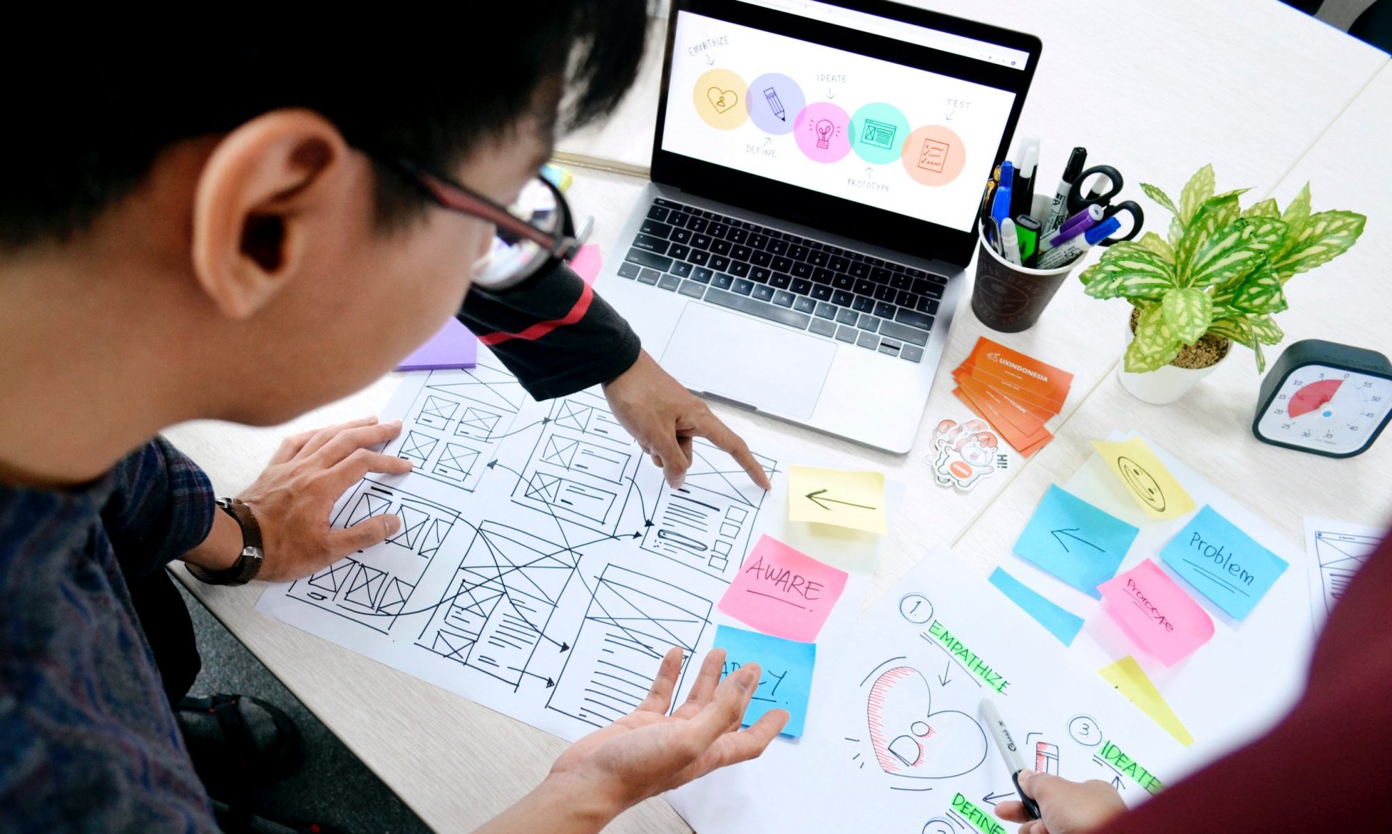
Card Sorting
I spent a lot of time figuring out what links we were going to use and what we would name them. This went straight to research questions 2 and 3, since we couldn’t have too many links or the home page would become overwhelming, and the names needed to be intuitive. Some of the names were directly lifted from the Libraries’ website or live Tripod, while others were created.
Donna Spencer’s Card Sorting was very helpful in this process, as it taught me both the practical information of how to conduct a card-sorting session, while also clarifying the higher Information Architecture perspective on how to think about the data that I was gathering.

The data showed that for many links there was almost universal agreement about which of the four boxes it should go in, but for several there was the suggestion for a 5th category, called variously, “Talk to a Human,” “Tripod for Dummies,” etc. I termed this category Quick Links. Taking these suggestions, Mary developed a sandbox version of Tripod to conduct usability sessions with.
I had mocked up a proposal, below, which focused on symmetry and primarily utilized the original 4 proposed categories.

Eventually, we landed on this version, below, that included the fifth category as “Need Help?: Talk to a Human” which incorporated feedback about putting the opportunity for human interaction front and center.

Conducting Usability Sessions
Using the sandbox, I developed a series of tasks and scenarios to test its usability. The tasks aimed to encourage users to find pages on the website that are commonly used by students. The graphic below shows the results of the sessions, with the rows each representing one user’s responses to the 8 tasks (one task per column). Red means the user did not complete the task, Yellow indicates there was difficulty or confusion with the task, and Green indicates they successfully completed the task. White indicates facilitator error.

As the results demonstrate, there are some areas for improvement, but generally the Tripod Sandbox allowed for students to access the resources they were looking for.
Additional Feedback
The responses from open-ended conversations at the end of the usability sessions reveal important insights into what students want to see out of Tripod. Many students indicate that they liked having “Talk to a Human” on Tripod as a way to quickly connect with an actual librarian. Including the “email a librarian” function, a link to subject specialist librarians, and RIAs in this section could be helpful for allowing students to quickly find a person who can help them with a problem. Many students also indicate they would like more subheadings within the four basic categories on the Tripod homepage, citing specifically the category “Research & Scholarship” as a little too broad. Initially, Mary and I prioritized symmetry for both the Find & Borrow and Research & Scholarship boxes and included four bullet points in each. But students indicated a preference for Asymmetry, like what Live Tripod has.
Next steps
One question that the entire process has brought up repeatedly, is how to design a Tripod that serves as many students as possible. Throughout the course of my UX Research, many STEM students indicated that they do not use Tripod very much if at all, and those who do prefer the Quick Links or things like Reserve a Space to be front and center on the Tripod homepage, whereas social science and humanities students vary wildly in their usage of Tripod, many going straight to Jstor or Google Scholar.
Future Tripod research would gain a lot from focusing specifically on how the different subject area majors interact with Tripod and trying to incorporate feedback in a way that maximizes utility across the disciplines