Digital Reserves Assessment, Spring 2021

Since more than half the Swarthmore student studied remotely this academic year due to the COVID-19 pandemic, the libraries needed to shift very quickly from providing print Course Reserves to providing digital copies of all required course materials. In the Spring of 2021, the Assessment Committee began to gather data in order to learn the answer to the following question:

What are the benefits of digital reserves to faculty and students and what are the costs to the libraries?

METHODS:

  • Faculty: we personally invited faculty who are known to make reserves requests to provide feedback via a questionnaire
  • Students: we held one focus group via zoom and used results of a campus-wide student survey on a pilot textbook affordability program (TAP). The libraries were able to add four questions to the survey to ask whether course readings on reserve at the libraries impacted student decisions to purchase textbooks
  • Library Staff: we gathered feedback first via department meetings of relevant staff and then held one, larger, inter-departmental meeting for further discussion

WHAT WE LEARNED

Faculty: While some faculty expressed dissatisfaction with particular digital platforms, they were appreciative of  having digital copies of required course texts available from the libraries during the pandemic and  expressed a desire that digital options remain available after all students are able to return to campus. One professor noted “I think students consult the material when it’s at their fingertips, so digital is a good idea.” and another wrote “Digital Reserves are accessible [meaning available] and helpful. Please keep them if it’s at all feasible.”

Students also appreciated access to digital copies of reserves materials, however, a majority of students used Textbook Affordability Program (TAP) Funds to purchase most of their required texts from the Campus and Community Store. Students in the focus group expressed an appreciation for choices between their purchased, print textbooks and the digital options the library provided. Although they purchased print texts, they made use of the library digital copies for pulling quotes and quick searches.

The results of the TAP Fund Survey indicated the program is successful, with students using the funds to purchase a majority of their course materials. While using course reserves at the libraries was the 2nd most frequent avenue to required reading, survey results demonstrate that the libraries may revisit their policy of providing library copies of every required text in light of the continuing availability of TAP Funds.

The survey also provided interesting data on reading preferences with a majority of students indicating a preference for reading in print rather than digitally. The results indicate that students choose digital copies when they are far less expensive, or when there are no print options available.​​​​

Library Staff worked heroically to provide digital access to course materials during the pandemic, including developing workflows to make in-house scans of needed materials that were not available digitally via any other source. While staff understand the value and benefit of digital copies for faculty and students, they want to provide them responsibly, considering accessibility (in the sense of accommodation), copyright, and the storage and management of the digital files we create.

WHAT WE DECIDED

The libraries will:

  • Use a hybrid approach to acquire print plus digital copies wherever possible from Ebook vendors for Course Reserves
  • Prioritize acquiring digital copies for Reserves, and in light of the TAP Fund Survey results, re-evaluate our policy to provide at least one print copy of every required text
  • Continue to explore responsible and robust options for Controlled Digital Lending (CDL) as options are developed 
Pandamonium

The effects of the global pandemic have unfolded so differently from what we first thought when the College closed for an “extended spring break” last March.

I’ve just trashed a draft of a post I began back then and next updated in May without ever publishing it. Too many things changed too often to be able to capture how users were engaging with our services, much less learn how we might improve them.

Similar to many other colleges, Swarthmore students did not return to campus last spring and most have not returned this fall. Instead, a new, completely different semester has begun.

Library services have shifted fundamentally – at first to online only, next to a request system for “curbside” pick-up of print materials, and just as of this past Monday, to a hybrid world of both online and in-person use of our collections, services and spaces (while maintaining the materials pick-up option.)

While most of us worked from home, my colleagues in the Access + User Services Department, along with co-workers in Collection Management + Discovery have done heroic work to find and make available digitally accessible copies of required course materials so that students remaining off campus could continue to have access to class materials and do research. Research and Instruction Librarians have revamped their former in-person practices, transforming them to the virtual environment. Some of us have needed to return to the libraries to work regular hours, putting ourselves more at risk for catching the virus.

As these changes occurred, we hastily wrote “temporary” FAQ Documents for our community (which we continue to update regularly) instructing people how to access library materials, how they can reach us with questions, to let them know what they may borrow and what to expect when the libraries open.

As the next normal unfolds, we’d like to move content from these short-term documents to our website, which was revamped over the summer as planned – unrelated to what is happening in the world.

What have these events and changes meant for the library experiences of our users? How do we know? What might we learn? Have the changes to the website (informed by usability session last year) demonstrably improved things? And perhaps most challenging, what research methods could I use that do not tax our users with One. More. Thing?

I do not yet have answers, but as a start, I moved our beloved, analog Comment Book online. I’m also planning usability sessions for the website recorded via zoom, inviting participants to share their screen.

It doesn’t seem like much, but I remind myself that within the context of what is happening in the world and in the country, every step we can take to make things clear, understandable and easier has value.

Streaming Film Assessment

This year, the libraries are doing an assessment of our film collections in order to better understand how changes in the film industry and technology, particularly streaming options, are impacting the libraries’ materials budget.

We’re investigating everything we can think of:

  • Purchase requests
  • Statistics from our licensed streaming packages
  • Statistics for video placed on reserve and checkouts
  • How many “ripping” requests we receive (to make DVDs available for streaming) and how much time this requires
  • Film related workflows from request to delivery
  • What supports and services for providing film might be duplicated or supported by our campus partners, academic technologists in ITS and the Language Resource Center.

So far, we’ve:

  • Gathered statistics on:
    • Our streaming packages
    • Films placed on Reserve
    • Netflix use
  • Spoken to colleagues in the Language Resource Center to learn about all the ways they support the use of film in the curriculum
  • Devoted a student Library Advisory Board (LabX) meeting to get feedback from students about their film use in order to learn:
    • How often they use the collections for study breaks and entertainment
      • whether they consider checking out DVDs
      • what the libraries might do to make watching DVDs more convenient
    • How they view films required for class:
      • what happens if their schedule prevents them from viewing a film outside of class at a time the professor arranges?
      • how they watch a required film that may be available only through a platform the libraries are unable to support, like Amazon Prime or Hulu?

Our next step will be to send a short survey to about twenty professors who are known to use a lot of film in their courses in order to learn:

  • About how many films they may require in a film-heavy course
  • Whether their need for film is growing
    • Are standard courses taught from year to year impacted?
    • Does film play a larger role in newer courses?
    • Does the proliferation of available content suggest growing need?
  • What drives their preference for format?
    • Availability?
    • Accommodation (captioning, multi-language subtitles)?
    • Copyright?
    • Big screen vs laptop?
    • Picture and sound quality?
    • Convenience of delivery?
  • Are provisions made for students to view film outside of class time?
  • What if a film they want to include is available only on a platform the library cannot support (such as Amazon Prime or Hulu?) What accommodations do they make for students?
  • How might the libraries best support their need for film?
    • How might we improve the request process?
    • Should we investigate the feasibility of providing students with Amazon Prime, Hulu or other streaming platform accounts?
    • What other ideas and opportunities could there be?

We hope our assessment will inform:

  • Whether the evidence we gather supports advocating for more dollars in the budget, or guides difficult choices in order to balance the budget and curricular need
  • How we might improve our workflows from purchase request to film delivery
  • Hidden opportunities that may improve our collections and services in the future

If you have ideas of other avenues to explore, please let anyone on the AUX Committee know! (Assessment and User Experience)

Alison Masterpasqua, Amy McColl, Peggy Seiden, Barb Weir, Mary Huissen, Pam Harris, Pat O’Donnell – with much support for this project from Jessica Brangiel and Nabil Kashyap

Wrap up the semester and tie it in a bow

I recently hosted a usability drop-in session supported by one of my student usability workers. We ran two navigational tasks on our catalog site: 1) finding reserves and 2) finding links to archival and digitized collections.

We used A/B testing for the second task; I ran the sessions using a test instance of our site on which I had placed links to other collections on the catalog home page, while the student assistant ran the tasks using the live site, where the links are behind a “more” button and a curtain.

Reserves

We ran a reserves task last spring within a few months of launching Alma/Primo and learned that users were not able to complete the task successfully. At all. While I do not like to admit that we’ve done nothing in the meanwhile to make it easier for users, this time the results were quite different:

  • 66% of users in our session successfully found reserves by searching by either the course name or course code and limiting their search with the Course Reserves scope.
  • 22% searched by course title and used facets to find reserves.
  • 11% of users looked for a top link to Reserves and they were not successful.

Huzzah! The only explanation I have for greater success is that once we knew addressing the problem with a customized solution would take months, we communicated the out-of-the-box path to Course Reserves through a variety of channels. Perhaps the communication had an effect, or perhaps users have become more familiar with the system and have learned the pathway as it is without customization.

Despite greater levels of success, since the users who struggled with the task continue to look for a top link for Reserves, the TriCollege Discovery and User Experience group (DUX) will discuss customization options.

Coincidentally, I’ve been conducting an environmental scan of other Alma/Primo sites within the Oberlin Group of colleges and found that Albion, Hope and Kalamazoo Colleges have put a solution in place that we’ll evaluate. We may also explore the solution that Whitman College Library created by customizing two separate scope options within the main search bar.

Links to Other Collections

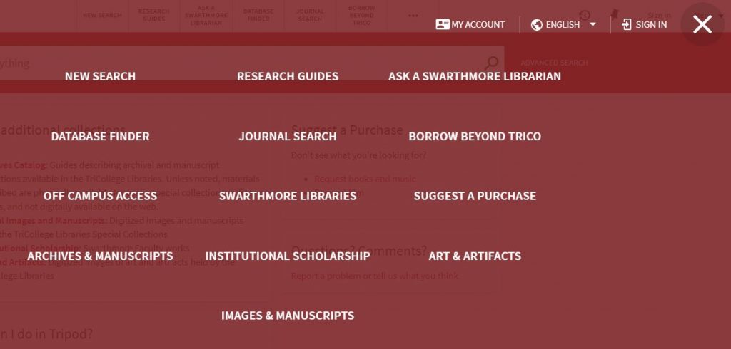
I chose this task because I’m motivated to reduce the number of top links in Tripod. Our users naturally look to the top links, but when they click on the more button (identified by three horizontal dots)

the more button

they are faced with an off-putting curtain of thirteen links.

curtain of 13 links

The reason 13 appear is that the system repeats the first 6 links which already appear at the top of the home page and adds the rest. Since I haven’t found anyone who has managed to eliminate the redundancy, I’d like to reduce the overall number of links to no more than six in order to make the more button unnecessary.

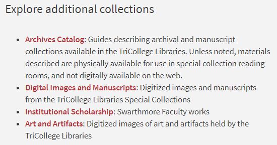
The results of this usability session pointed to a solution (already implemented) that replaces the final four links behind the curtain with highlighted space on the catalog homepage.

Each user whose session took place on the test instance with this card in place found the collections easily, while users exploring the live site had trouble.

elevated to the home page

I’m pleased with the progress we are making with usability at Swarthmore. I’m grateful for a great team of student assistants who support the mechanics of usability sessions and for receptive colleagues.

Yet my experience tells me that usability results often point to larger conceptual questions in addition to the web fixes that might be addressed by our developers and this can be disheartening.

It’s great if developers implement changes that solve usability issues, but library research and catalog user experience can go beyond things that might be addressed with code.

  • How can we build contextual information about how to do research, where to find appropriate resources and how libraries and databases function into the catalog?
  • How can our web pages, the catalog and LibGuides play together more intuitively to the benefit of our users?

Library Website Usability Sessions

Student library UX workers and I facilitated 14 usability sessions on the Libraries’ website in late September in order to learn whether changes made to the site over the summer are intuitive for users.

We began each session by asking basic demographic information, the user’s year in school or college affiliation and general areas of academic interest. We also asked if they had ever used the site before and followed up by asking “why-or-why-not?” (And it was at this point we learned that many Swarthmore students think that the Tripod catalog and the Libraries’ website are the same thing…)

We ended each session by asking about impressions of the site, what works, what does not and what could make it better.

In between these opening and closing questions, facilitators used scenarios which prompted users to accomplish at least one (but not all) of the following tasks using the site:

  • Find different kinds of research help
    • Find citation help
  • Get access to popular resources: the New York Times and The Economist
  • Find space for quiet study and group study spaces
    • Reserve a group study
  • Borrow Technology
  • Discover what online resources are available to Alumni
  • Find information for visitors: hours, use of computers, printers, scanners, and group study rooms.

Here is what we learned:

Research Help + Citation Help
We captured 9 sessions using the Research and Citation Help scenarios. While eight of the nine users ultimately had success finding at least one kind of research help using the site, only one user, a librarian, began at the Get Help page.

Alternate successful paths to research help were via:

  • a link to Research Guides within the Tripod search widget
  • the Chat button
  • Support for Research + Teaching>for Students

Duplicate paths to information can be great, but since students did not use (or maybe see or understand) the Get Help link, we’re considering adjustments. We may change the label (after testing out suggestions for something more intuitive) and we may consider integrating the Get Help content with overlapping content on the Support For Students page.

An unexpected outcome of this task was to learn that many students equate finding resources with getting research help. If a user begins with this understanding, choosing the “Find Resources” link instead of “Get Help” makes perfect sense, but the result is that students overlook or remain unaware of the variety of library support available outside of the Tripod catalog.

More than half of the users began this task with either a Tripod catalog search or via the Find Resources link in the site navigation instead of Get Help. A majority of them probably would not have discovered information about the kinds of research help from Librarians or Guides for which the scenarios were designed except for being encouraged to seek it due to the context of the usability session.

There was only a 50% success rate for the citation help task. If the user began seeking research help by looking for resources, they were not successful in finding citation help on the site.

Additionally, these unsuccessful sessions demonstrated that anyone who searched the entire College website (via the site search magnifying glass) using the term “citation” or “citations” was not successful. Instead, top results for these queries on the College site are for the Writing Center, academic departments, and even the Public Safety Department. (Parking tickets!)

We’re adjusting our headings in hopes of having citation help from the libraries appear as a top result in a search of the College website, but the problem raises an additional structural issue that affects library site usability: a lot of library help is in LibGuides, and as a result is not exposed to a site search within swarthmore.edu.

The citation information on the Writing Center website is quite good although not as thorough as what the Libraries’ offer (via LibGuides.) Is there any opportunity here to collaborate with the Writing Center by linking to one another’s information?

We’re also exploring the feasibility of a technical solution that may pull LibGuides content into a swarthmore.edu site search.

Find Popular Resources
We captured 7 sessions of this task beginning with getting access to the New York Times. Three users had success via the Popular Online Resources page. Another three tried a Tripod search for the Times, but only one of these had success getting access. One user could not get access to the Times at all.

The Popular Resources page is a help to those who find it, but it’s buried in the navigation. A hover menu would be a big help.

Library Space
We ran this task in four sessions and each user had success.

Borrow Technology
We ran eight instances of this task with mixed results. The information is on the Support for Students page, but underneath the rather confusing heading “Need Something?”

Since many users were looking for the information on the Borrow + Request page, I added it there and it had an immediate effect.

Overall, six users were able to find the information, (some after I had changed the site) but three were unable to find it even after the change.

A common response to this scenario was “I already know the libraries lend chargers and I would just go to the desk and ask for one.”

Alumni + Visitor tasks
Users were mostly successful with these tasks, but whenever they were not, it was due to the information being organized into Drupal link-list-panes. If the user chose the wrong link, they did not return to the list in order to accomplish the task.

As a result, we have plans to reorganize the information out of the current combined page into separate pages, one for Alumni and another for Visitors.

Larger Issues
Many of our users are confused by the interplay of the Libraries’ website and the Tripod catalog. Additionally, usability of our website suffers from being unable to provide hover menus that expose the extent of our content at a glance.

While we may be able to address Tripod issues and branding with our Trico partners, the path to resolving functional and structural limitations at the College is not as clear. Meanwhile, we’ll continue to make changes to the navigation within the structure we have and continue testing for usability.

Space exploration, or, UX on-the-fly

This semester I’ve noticed frequent evidence of science-y stuff happening on the big whiteboard that’s outside my office as I arrive at work each day. The content is striking because my office is in the Humanities and Social Sciences Library and we have a recently renovated Science Library nearby.

I’ve noticed groups of students working on science projects in this space throughout the day, so decided to start asking them why they are choosing to work here instead of the science library.

The first student I asked was working out a chemistry problem on the whiteboard. He said he chooses the space because it’s a little quieter and because the science library “has a pretty overwhelming STEM vibe” that makes him uncomfortable.

But my direct question seemed to make him feel uncomfortable too and I worried later (especially after noticing the beautiful chemistry symbols erased from the whiteboard) that I may have made him feel as if he didn’t belong. Note to self: leave brief reply cards in this area and collect the information anonymously and more voluntarily! I’d love to know more from this student. What did he mean by the uncomfortable STEM vibe? After all, chemistry is a STEM subject.

I next approached a group of three students hard at work on a science project in this same space and inquired what draws them here instead of the Science Library. Their answer was different: they meet together every Wednesday morning and come from different places. This space is the most centrally located.

However, they added that the group spaces in the Science Library are not as conducive to their work: spaces there are more open and the group feels more exposed than they like, plus it’s generally louder over there.

This particular spot is about to disappear as a result renovation this spring (hence the empty stacks) but it’s interesting to note the aspects that make it appealing:

  • it’s centrally located
  • quiet-but-not-silent
  • has a large whiteboard
  • is enveloped by tall stack ranges on either side of a spacious work table which help create privacy and a more enclosed feeling (maybe like a little hug from the libraries? I can hope!)

As we think about library space, we gather lots of quantitative data: how many students use a space, what they use the space for, what kinds of equipment they use, what times of day and night are more crowded, how much space we need for collections, how to balance desires for quiet with the need for group work space. It’s important to remember to gather qualitative data from a broad spectrum of users too.

Now about those anonymous, voluntary reply cards…

Small victories

A few weeks ago I overheard someone say “The month of August is like one, long Sunday evening” and I smiled, knowing exactly what she meant. It’s a bittersweet time saying goodbye to a more relaxed summer pace in the libraries mixed in with our preparation for saying hello to the official start of the semester, which is still a week away. But if the analogy holds true, I believe the weekend is over and it’s already Monday morning despite the calendar indicating it’s still August!

Student athletes who compete in autumn sports arrived last week and international students arrived several days ago along with cohorts of students whose jobs facilitate the beginning of the semester or require intensive training (resident advisers, student academic mentors, orientation leaders and the like.)

As I arrived at work this morning, it was abundantly clear that today is “move in day” for first year students. Ready or not, we’re off to the races!

My work is not greatly affected by the seasonal shifts of the academic year. It’s true there are fewer library users in the summer months, but I remain as engaged as ever as an advocate for their ideas and improved experiences.

But even though I’ve been at this for awhile, it continues to surprise me how much time can elapse from first learning the germ of a good idea for an improved service to turning the idea into reality.

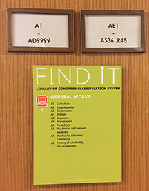
Almost one year ago, students in the Library Advisory Board and User Experience Group (LabX) suggested we post guides to LC class subject areas within the stacks at the point of need, for example placing a small poster at the beginning of the “As” saying: A class is for General Works, Encyclopedias, Dictionaries, etc.

This was a simple idea I thought would be easy to turn into reality. But the pathway took more twists than I imagined and it started with library staff discussions about instead providing a guide to the entire range of LC subjects centrally on each floor and making attractive LC Class subject guide bookmarks freely available. That is, er, not providing the stack guides at the point of need or curiosity.

This example of advocating for users is certainly a low stakes one; moving forward with the idea was not expensive or disruptive and the impact may not be measurable beyond any appreciation expressed by the student group which offered the suggestion.

But it illustrates that user advocacy can be tricky, particularly in an institutional environment that has a heart for consensus and a decision making structure that is sometimes opaque.

I have been grateful for this low-stakes project because it has provided me with needed practice to grow more confident professionally despite push back from trusted and well meaning colleagues.

I hung the stack guides up at the end of yesterday and felt victorious.

Best wishes for the new academic year everyone!

Dog Days of Summer

It’s a Friday afternoon in the midst of a punishing heatwave in Swarthmore during the dog days of summer…

Photo by Paulette Wooten on Unsplash

…we’re just past the midpoint of the calendar year and a new academic year is on the horizon. What a good time to take stock of some of the goals we have achieved so far and to think about new ones for the upcoming year.

Since starting in this position, I’m proudest of these things:

  • IRB approval for usability testing
  • Approval to hire students at the highest pay grade who earn CITI certification and are trained as usability session facilitators
  • Robust usability sessions of our online library tools each month. Huzzah!
  • Establishment of an engaged Library Student Advisory Board for User eXperience (LabX) which meets monthly and provides invaluable feedback
  • Improved wayfinding signs in McCabe Library with the help of my colleague, Visual Initiatives + Exhibitions Librarian Susan Dreher

Some goals for this coming year:

  • Communicate my work more effectively through more frequent, shorter blog posts, posts to our library staff email digest, flyers, and an occasional newsletter (maybe…)
  • Collaborate with the AUX Committee to formalize our Assessment Plan based on our operational goals and objectives
  • Cultivate the use of our Data Dashboard for more cross-pollination of our data stories
  • Seek out relationships in the college community outside the libraries. I’m looking at you Office of Institutional Research, Communications Office and Center for Innovation and Leadership!
  • Continue to work on the ACRL Proficiencies for Assessment Librarians and Coordinators
  • Build relationships with librarians outside of Swarthmore College by becoming more active in professional organizations

Happy weekend – stay cool and hydrated!

Bench-marking the user experience from one interface to another

As we settle in becoming more accustomed to the newest version of Tripod, it is useful to look back and remember the massive amounts of work that went into system migration.

A year ago, most of my colleagues were heavily invested in necessary behind-the-scenes planning and technical work, while I focused on how best to address the approaching changes to the public-facing user interface with our users.

Many of us have opinions about how we’d like websites to look and feel in addition to how we want them to work, but the best way to know whether an interface functions well aside from visual design is through usability testing. Are users able to accomplish the tasks for which they came to the site?

In preparation for system migration, I held usability sessions with the now-retired version of Tripod in order to be able to compare results for how users accomplished essential tasks there with what we would learn from usability sessions in the new system.

What tasks are essential to users of a library search interface? We decided to test the following:

  • Account login: including saving items of interest to lists, sharing them with others or sending them to yourself via email or text
  • Known-item searches: placing a hold or a request from another Trico Library, and if the item is not available, taking the next step toward E-ZBorrow and ILL
  • Broad searches followed by use of facets (the “Refine your Search” options at the left of the screen) to limit results
  • Finding items on Reserve for class

In the fall of 2018, users of “old” Tripod had success logging into their accounts, adding items to lists of favorites, and emailing or texting the information to themselves or a research partner.

They were able to find specific titles and to place holds and Trico requests. And despite some participants having no experience with E-ZBorrow or ILL, they had heard about these services and were able to navigate to the appropriate links.

But despite the near ubiquity of facets on monster, commonly used websites like Amazon, many Swarthmore students either have not noticed them in Tripod or have not used them. This task caused trouble.

And every user struggled to find items on Reserve for a specific course using Tripod.

These results were not surprising. Library searching can be complex, we know there are students who do not use Tripod and novice researchers may struggle with even the most intuitive interface. The purpose of these sessions was to set a baseline for comparing results between old and new Tripod.

So about those! Results from post-launch usability sessions on “new” Tripod early in 2019 were largely the same: students navigated intuitively to the basics of what they could accomplish while logged into their account, they found relevant results for their known-item searches and pathways to place requests and to borrow beyond Trico. They also overlooked facets and really struggled to find Reserves!

We’ve already made improvements to the Tripod interface and have prioritized making the pathway to Reserves more intuitive before classes begin in the Fall.

Regular usability sessions are vital to improving user interfaces and the libraries run them monthly during the school year. Keep your eyes out for calendar announcements, stop by and try it! The “tests” are of our online interfaces, not users! It’s fun, you’ll be rewarded with a home-baked treat, and best of all, you’ll help to keep making Tripod (or the website, or Research Guides) better!

MISO

The Libraries and ITS participated in the Measuring Information Service Outcomes, er, the MISO survey this year. MISO is a web-based quantitative survey designed to measure how faculty, students and staff view library and computing services in higher education.

The two departments first participated in this nationally run survey in 2016 and decided to repeat the survey every three years. We hope to learn from longitudinal data and want to be aware of any trends.

The Libraries were particularly interested in the 2019 survey results, since the new version of our catalog, Tripod, launched in December and the survey ran shortly afterward, in February. We knew there were hiccups in the Tripod launch and were eager to compare the community responses about the library catalog to their responses in 2016.

Interestingly, while we have much still to learn from MISO results, there were no statistically significant differences in how our community views our services since 2016, including the catalog, Tripod. Yet, we are aware of deeper questions to ask of the data and of areas for which additional research is needed.

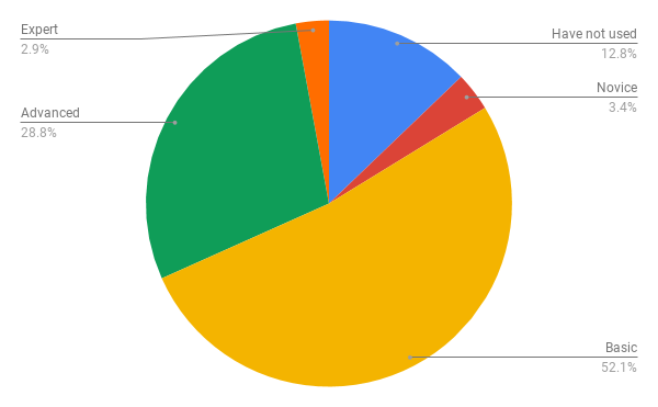
For example, we learned that a higher percentage of faculty do not use Tripod or library databases than we would expect and further discovered that the number of faculty who do not use these resources has increased from 2016 – 2019. The number of faculty who say they “do not use” Tripod rose from 7.4% in 2016 to 12.9% in 2019. We’re in the process of cross tabulating the data with help from colleagues in the Office of Institutional Research in order to learn the extent to which academic division or other factors may play a role in the increase.

Faculty Survey: Skill Level with Tripod

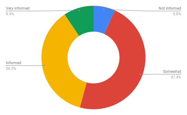
Another area for further exploration is the number of faculty, students and staff who say they feel “not informed” or only “somewhat informed” about library services. To help us communicate what services we offer more effectively, we need to first learn what people think of when they see the term “library services.” Do they think about circulation, or perhaps access to online resources? Naturally, we’d prefer a larger percentage of our users feel “Informed” about our services, so we’re thinking of ways to address this.

Student Survey: How informed do you feel you are about library services?

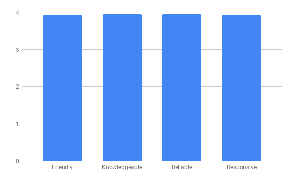
On a wonderful positive note, our faculty, staff and students continue to rate their satisfaction with librarians very highly, between 3.8 or 9 on a 4 point scale, for being friendly, knowledgeable, reliable and responsive. Thank you Swarthmore community – we love you right back!

Staff Survey: How satisfied are you that the library circulation staff are: Friendly, Knowledgeable, Reliable and Responsive?